| Author | Thread |
|
|
02/02/2003 01:28:51 PM |
Greetings from the Critique Club :)
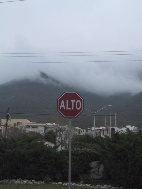
I think this photo could be much stronger. My primary problem with this image is that the colors are flat. There is not much of interest above the sign either. Maybe a tighter crop that cuts out most of the sky and wires above the sign would improve the overall image. Once that has been done, you will be dealing with the clutter behind the sign. The buildings and the wires directly behind the sign are still going to create distraction for the viewer in this photo.
Compositionally, I believe that the dead centering of the sign doesn't really offer a strong image. I believe that making the sign a much larger part of the image would have created more impact with this photo.
John Setzler
|
|
Comments Made During the Challenge  |
|
|
01/26/2003 09:17:06 PM |
| The photo is a little washed out. The sign is a little too centred. jgillard6 |
|
|
|
01/26/2003 11:40:04 AM |
|
|
|
01/26/2003 02:05:23 AM |
| Perhaps this photo is slightly underexposed... looks dark to me and the trees are difficult to see. I like the background but the powerlines are a distraction. |
|
 Photographer found comment helpful. Photographer found comment helpful. |
|
|
01/23/2003 03:23:44 PM |
| This sign I do not understand at all. The shape is the international shape for a stop sign, but this appears to be the name of a town. But it is a "road sign" and this is a nice photo, a little dark and soft focus but nice. Love the clouds on the mountains. Wish you could zap out the power lines. Not a bad photo at all. Worth a 6. |
|
|
|
01/23/2003 10:55:02 AM |
|
|
|
01/22/2003 08:44:03 PM |
| Lovely scenery...I wonder if the sign were off to the side of the shot it would be more effective? |
|
| Photographer found comment helpful. |
|
|
01/21/2003 07:38:12 PM |
| Very clear shot, but a little dark (I know it's a gloomy day...) Too bad about the overhead wires, they seem to be everywhere! 6 Swash |
|
|
|
01/21/2003 06:18:06 PM |
| Ok, I think I've just learnt "stop" in a different language. It looks like you were dealing with some adverse weather conditions here, which have made the photo rather dark. I think you may have included too much sky in the photo. |
|
| Photographer found comment helpful. |
|
|
01/20/2003 07:31:28 PM |
| Is that just a Stop sign? |
|
|
|
01/20/2003 02:48:03 PM |
| contrast is really low on this - very grey |
|
|
|
01/20/2003 11:55:59 AM |
This seems to be a little underexposed, plus I'm not a fan of powelines in pictures..
mhh... this is Monterrey, isn't it ? |
|
| Photographer found comment helpful. |
Home -
Challenges -
Community -
League -
Photos -
Cameras -
Lenses -
Learn -
Help -
Terms of Use -
Privacy -
Top ^
DPChallenge, and website content and design, Copyright © 2001-2025 Challenging Technologies, LLC.
All digital photo copyrights belong to the photographers and may not be used without permission.
Current Server Time: 03/12/2025 01:31:58 PM EDT.