| Author | Thread |
|
|
01/27/2003 06:43:13 PM |
Critique Club Comments by Grayce M. Dillon aka Gracious
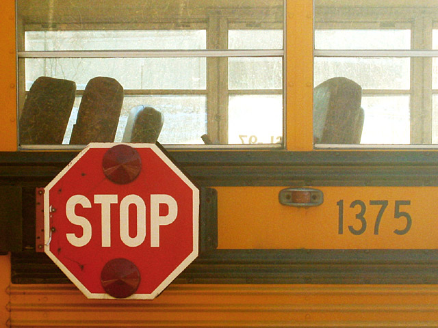
The first thing to strike me about this image is the coloring. Yellow and red are both vibrant and cheerful.
The next thing to attract my attention is the familiarity of the subject. Quite universally appealing I think.
I like that you composed the picture with the sign off-center.
There is a line across the center, dividing the image in half. Not especially pleasing. The other drawback is the over-exposed windows. I understand the problem is that by seeing through the bus the highlights were unavoidable. Perhaps the solution may be to expose for the windows, or maybe eliminate the windows completely with a different composition. The coloring here makes a very worthy subject.
Focus is a bit too soft, and saturation could be boosted as well.
Regards,
Grayce |
|
 Photographer found comment helpful. Photographer found comment helpful. |
Comments Made During the Challenge  |
|
|
01/26/2003 07:36:42 AM |
| Looks over exposed and grainy, nice composition. |
|
| Photographer found comment helpful. |
|
|
01/25/2003 01:08:03 PM |
| I love the colours and the composition. |
|
| Photographer found comment helpful. |
|
|
01/23/2003 10:40:34 PM |
| nice variation, very thoughtful. nice color against the yellow schoolbus |
|
| Photographer found comment helpful. |
|
|
01/23/2003 01:40:20 PM |
| The bright windows are a little distracting, but the contrasting colors are good. |
|
| Photographer found comment helpful. |
|
|
01/23/2003 09:23:45 AM |
| It looks like that stop sign is tacked to the bus. This is an interesting shot, but I feel the colours are a little washed out especially the more to the right you look. |
|
| Photographer found comment helpful. |
|
|
01/22/2003 11:05:00 PM |
| Never thought of this as a "road sign" but I guess I really is. Great ingeniuity. But tell them the bus is filthy and to wash it. Good photo. The technicals are pretty good. Not really exciting but right in there. It's a 6. |
|
| Photographer found comment helpful. |
|
|
01/22/2003 01:43:19 PM |
| the right half seems too washed out, and the stop sign isnt totally in focus |
|
|
|
01/21/2003 07:49:27 PM |
| Very clear stop sign. Interesting catch on the side of the bus. The harsh lighting seems to really affect the right side of the shot. 7 Swash |
|
| Photographer found comment helpful. |
|
|
01/21/2003 06:28:42 AM |
| It could do with a bit more contrast, I guess you were looking towards the sun. Nice idea though. |
|
|
|
01/20/2003 09:17:38 PM |
| if the sign is the subject of the photo it is off center |
|
|
|
01/20/2003 07:10:00 PM |
| Nice subject and composition although the photo is a little grainy. The black is a little washed out (perhaps levels in photoshop could have helped) and the yellow is showing some artifacts. Of course, depending on the camera (and or zoom) used you may have done quite well. |
|
| Photographer found comment helpful. |
|
|
01/20/2003 02:35:13 AM |
| Maybe a little less contrast and some despeckling would have helped.. Cub |
|
| Photographer found comment helpful. |
Home -
Challenges -
Community -
League -
Photos -
Cameras -
Lenses -
Learn -
Help -
Terms of Use -
Privacy -
Top ^
DPChallenge, and website content and design, Copyright © 2001-2025 Challenging Technologies, LLC.
All digital photo copyrights belong to the photographers and may not be used without permission.
Current Server Time: 03/12/2025 02:30:27 PM EDT.