| Author | Thread |
|
|
01/31/2003 09:54:24 PM |
| i cant believe this did so low. i liked it quite a lot. very graphic design and a right-on exposure. good work! |
|
 Photographer found comment helpful. Photographer found comment helpful. |
Comments Made During the Challenge  |
|
|
01/26/2003 11:07:40 PM |
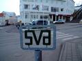
| nice colours here, very vigbrant and alive, but wonder if you should have shown more of the sign, it appears that you've cut out some of the top of the name?? Sure comes alive at you though! Nice job. |
|
| Photographer found comment helpful. |
|
|
01/26/2003 02:10:36 PM |
|
| Photographer found comment helpful. |
|
|
01/26/2003 01:48:36 PM |
| so with a digital camera you can edit the pictures, cut out different neon letters, set them against a black background, spell out anything you like. looks real neat, kinda like old-fashioned newspaper-cut randsom notes, only bright neon. |
|
| Photographer found comment helpful. |
|
|
01/26/2003 11:29:51 AM |
| off topic, an advertisement not road sign |
|
| Photographer found comment helpful. |
|
|
01/26/2003 02:03:59 AM |
| I really like the colors in this photo. But the cropping is a little confusing... I get the feeling like I'm missing something. Focus and exposure seem right on. |
|
| Photographer found comment helpful. |
|
|
01/24/2003 07:45:15 PM |
| Very bright and colorful. Good focus, love the colors. It seems very tightly cropped, was this to exclude bad things? If possible, a tad looser crop might have been nice. 8 Swash |
|
| Photographer found comment helpful. |
|
|
01/23/2003 09:03:59 PM |
| Beautiful colors, nicely focused. Maybe a little tightly cropped. But I do not take this to be a "road sign". It is a business establishment sign. |
|
| Photographer found comment helpful. |
|
|
01/23/2003 11:33:28 AM |
| Interesting colors, cropped a little tight though. |
|
| Photographer found comment helpful. |
|
|
01/22/2003 07:18:07 AM |
| This is an interesting photograph. I find that you cropped it a bit too close to the letters though, and that's a shame, because I think it detracts from it. keep up the good work :) -Annida |
|
| Photographer found comment helpful. |
|
|
01/21/2003 05:23:00 AM |
|
| Photographer found comment helpful. |
|
|
01/21/2003 12:18:05 AM |
| Nice exposure and focus (very sharp), and colour. Why is the last L partly cropped? |
|
| Photographer found comment helpful. |
|
|
01/20/2003 02:17:44 PM |
| Very nice shot... but is it a "road sign"? I like it too much to take off points for such nitpicking. |
|
| Photographer found comment helpful. |
|
|
01/20/2003 07:28:03 AM |
| This isn't a road sign - it's a shop sign... |
|
| Photographer found comment helpful. |
|
|
01/20/2003 01:23:12 AM |
| I'm a bit reluctant to qualify this as a road sign, even if it is a sign that's on the road. Aside from that, though, it's a little blurry, and you cut off bits of the letters that should've stayed. |
|
| Photographer found comment helpful. |
Home -
Challenges -
Community -
League -
Photos -
Cameras -
Lenses -
Learn -
Help -
Terms of Use -
Privacy -
Top ^
DPChallenge, and website content and design, Copyright © 2001-2025 Challenging Technologies, LLC.
All digital photo copyrights belong to the photographers and may not be used without permission.
Current Server Time: 03/12/2025 01:42:01 PM EDT.