| Author | Thread |
|
|
02/03/2003 06:17:39 AM |
Justine,
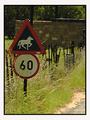
Thanks for the critique. I found it to be helpful. I agree with the part about the head. It and the dark jacket blend in with the background. A cap would've been good. |
|
|
|
01/28/2003 04:51:01 PM |
CC:
Hello Jitams!
______________
Fits The Challenge-Yes.
Composition-Nicely arranged.
Background-Good.
Digital Processing-_Dark_. It's difficult to distinguish between the head, the camera and the background. Levels adjustment would of helped some, hair bleach or a light colored baseball cap. I saved this shot and lightened it just a bit...hey I can see you hair now. :) Technically this is a very solid shot.
My Opinion-Hope I'm not sounding overly critical.
I haven't even told you that I liked the idea and thought it was very clever and I voted a 7. My grandson's [ages 12&13] thought this was a riot and got a big hoot out of it. Three cheers for your good eye, and creative mind. Thanks for allowing me to review your 'Head Games'.
|
|
 Photographer found comment helpful. Photographer found comment helpful. |
Comments Made During the Challenge  |
|
|
01/26/2003 09:18:56 PM |
| Love it. Right on. Would have liked a little differentiaion between the background ant eh head since the sign with the head is your subject. But still a good shot. |
|
| Photographer found comment helpful. |
|
|
01/26/2003 02:22:28 PM |
| interesting idea and angle |
|
| Photographer found comment helpful. |
|
|
01/26/2003 11:34:29 AM |
|
| Photographer found comment helpful. |
|
|
01/25/2003 07:14:41 AM |
| Nice bright yellow. Not sure I like to the see the back of a head in the the photo. Wow, great camera. |
|
| Photographer found comment helpful. |
|
|
01/24/2003 10:05:34 AM |
| Unfortunately, overexposed on the sign itself. Otherwise a reasonably interesting shot, and humourous. |
|
| Photographer found comment helpful. |
|
|
01/24/2003 07:13:14 AM |
|
| Photographer found comment helpful. |
|
|
01/24/2003 12:43:01 AM |
|
| Photographer found comment helpful. |
|
|
01/23/2003 11:05:30 PM |
| It looks like some tag team photography going on here - congrats. That also looks like a good camera in his hands. I love the humour of the sign in this shot - very dry. Composition is pretty good however the top edge is a little uncomfortable - difficult to crop with the top of the sign crooked. I wonder if rotating the image to crop along the sign edge would have worked or looked silly. |
|
| Photographer found comment helpful. |
|
|
01/22/2003 11:50:48 PM |
| HAHAHA!! thats really funny!! 10 |
|
| Photographer found comment helpful. |
|
|
01/22/2003 11:16:18 PM |
| Wow. Best picture in the competition, simply incredible. |
|
| Photographer found comment helpful. |
|
|
01/22/2003 10:32:35 PM |
| i don't understand what you are trying to portray. the sign is okay, although it's not to interesting to me. the focus is spotty at best and is almost distracting |
|
| Photographer found comment helpful. |
|
|
01/21/2003 10:53:25 AM |
| Meh. It's kinda funny, but I don't find the photo to be that interesting. |
|
| Photographer found comment helpful. |
|
|
01/20/2003 03:40:05 PM |
|
| Photographer found comment helpful. |
Home -
Challenges -
Community -
League -
Photos -
Cameras -
Lenses -
Learn -
Help -
Terms of Use -
Privacy -
Top ^
DPChallenge, and website content and design, Copyright © 2001-2025 Challenging Technologies, LLC.
All digital photo copyrights belong to the photographers and may not be used without permission.
Current Server Time: 03/12/2025 06:59:13 PM EDT.