| Author | Thread |
|
|
02/01/2003 09:29:15 PM |
Critique Club Review
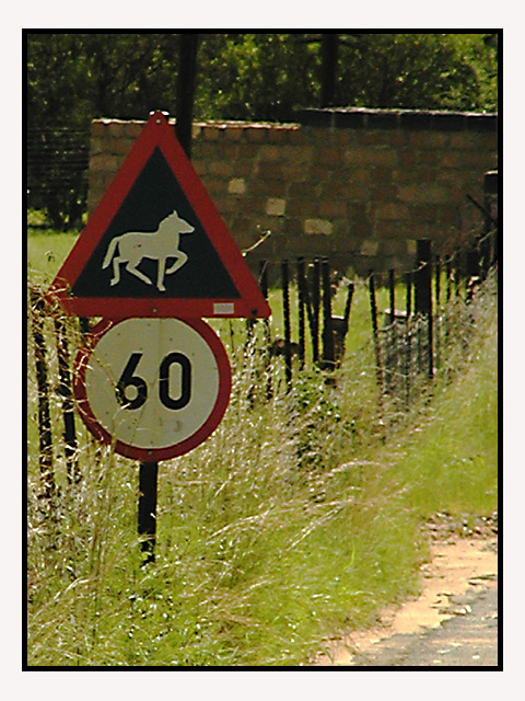
I can see that the sign was your central focus point. However, there are some many things here competing for attention. The grass is in the way of the sign along the left side, the back lightng calls attention to the wall further on, and in general the light angle from behind the sign, tends to diminish the importance of the sign as all else is brightly lit. Naturally you cannot make the wall go away, but a bit of a different angle could have brought a bit more of the road into play. (It is barely there in this photo.) Also this would be a very good time to use a small f stop to shrink the depth of field. With the background out of focus, and the sign in focus, the sign would not have to compete for attention and at the same time the rural feel would be kept. It also might be the time to tramp down a bit of the weeds trying to cover the sign. The picture does express your title well, and I do like the overall effect. |
|
 Photographer found comment helpful. Photographer found comment helpful. |
Comments Made During the Challenge  |
|
|
01/24/2003 12:32:49 AM |
| nice, not thrilled about the border but nice |
|
| Photographer found comment helpful. |
|
|
01/23/2003 03:55:28 PM |
| No much in focus. Not an exciting or different photo. Looks like a snapshot taken from the car. Not my kind of photo. |
|
| Photographer found comment helpful. |
|
|
01/23/2003 10:51:05 AM |
| nice signs, but they don't stand out well enough on a background of the brick wall... |
|
| Photographer found comment helpful. |
|
|
01/22/2003 02:50:39 AM |
| Your photo looks out of focus, or maybe it's just grainy? NIce try though! |
|
| Photographer found comment helpful. |
|
|
01/21/2003 07:48:36 PM |
| I think that perhaps your white balance is a little bit off. I think the image would have been better if the sign was brighter (perhaps a different time of day). |
|
| Photographer found comment helpful. |
|
|
01/21/2003 11:24:57 AM |
| This photo looks a little dark on my monitor, and is somewhat fuzzy. It also appears that the photo is severely oversharpened, giving it a kind of odd look. |
|
| Photographer found comment helpful. |
|
|
01/20/2003 08:17:48 PM |
| Out of focus I think. Plus you should have over-exposed this shot a little to lighten up the sign. |
|
| Photographer found comment helpful. |
|
|
01/20/2003 04:35:45 PM |
| I like the idea and composition. For me it's a little dark and seems to be slightly blurred. 5 |
|
| Photographer found comment helpful. |
|
|
01/20/2003 01:45:11 PM |
| Like the humour in the title,picture is nice too. |
|
| Photographer found comment helpful. |
|
|
01/20/2003 01:34:19 PM |
|
| Photographer found comment helpful. |
|
|
01/20/2003 02:27:39 AM |
| Focus is off, contrast seems a bit hars, and it could have been a little brighter.. Cub |
|
| Photographer found comment helpful. |
Home -
Challenges -
Community -
League -
Photos -
Cameras -
Lenses -
Learn -
Help -
Terms of Use -
Privacy -
Top ^
DPChallenge, and website content and design, Copyright © 2001-2025 Challenging Technologies, LLC.
All digital photo copyrights belong to the photographers and may not be used without permission.
Current Server Time: 03/12/2025 07:10:02 PM EDT.