| Author | Thread |
Comments Made During the Challenge  |
|
|
11/06/2014 05:04:31 PM |
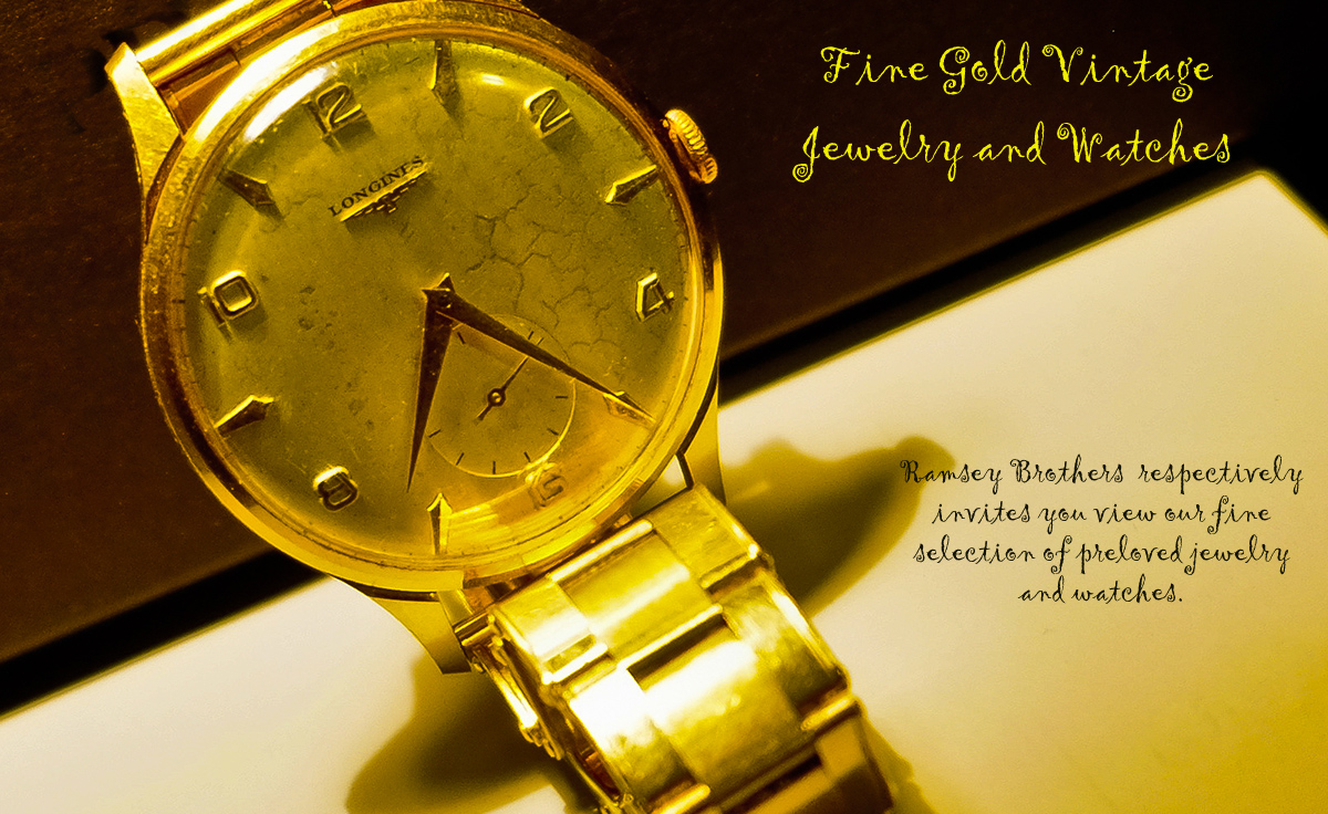
| I like the photograph quite a bit. Maybe the highlights are a little too bright for my taste, but the face of the watch is nice. I would have used a different font, though. |
|
|
|
11/06/2014 11:19:44 AM |
| Great tone and processing but the font is hard to read and forces me to concentrate to much on it to read what it says. |
|
|
|
11/04/2014 12:26:55 AM |
| i think you meant "respectfully"? cool watch |
|
|
|
11/03/2014 10:21:37 AM |
| I think having it resting on something else could have looked better, also some softer light to prevent the blown highlights would have been nice. Not crazy about the loopy font for the lettering either. |
|
|
|
11/01/2014 09:57:03 PM |
I don't like your font... it needs to be able to be quickly read as I pass by your billboard or flip through my magazine to get to another article. It needs to grab me, not make me struggle to read it.
Also, the bright yellows in the watch band and the blown spots compete for my attention (and win) against the face of the watch.
I do like your composition, although I would not have cropped it so close on the upper edge of the face of the watch.
I wish the face of the watch were the brightest spot in the whole image... so my attention would go there immediately and want to stay there... and buy your jewelry. :D
I love the angle of the watch at a tilt to make the advertisement not so rigid. Good choice. 6 |
|
|
|
10/31/2014 05:10:57 PM |
| This acid yellow is a bit jarring |
|
|
|
10/31/2014 11:58:30 AM |
| My observations: Did you mean "respectfully" instead of "respectively"? There is too much yellow for me. I know it's a gold watch, but the color seems off. Lighting is a bit harsh, creating blown out spots and distracting shadows. |
|
Home -
Challenges -
Community -
League -
Photos -
Cameras -
Lenses -
Learn -
Help -
Terms of Use -
Privacy -
Top ^
DPChallenge, and website content and design, Copyright © 2001-2025 Challenging Technologies, LLC.
All digital photo copyrights belong to the photographers and may not be used without permission.
Current Server Time: 04/26/2025 09:08:31 AM EDT.