| Author | Thread |
Comments Made During the Challenge  |
|
|
11/05/2014 08:34:35 AM |
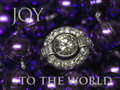
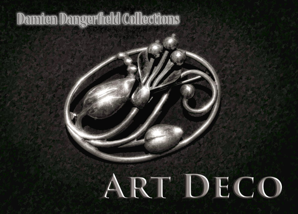
| The text seems to have more pop than the brooch and pulls my eye away. |
|
 Photographer found comment helpful. Photographer found comment helpful. |
|
|
11/03/2014 09:33:22 AM |
| Not too bad - I wish the jewelry looked a little more "real", the effect on the background looks good but I don't think it improves the look of the jewelry. |
|
| Photographer found comment helpful. |
|
|
11/02/2014 11:19:02 AM |
| In my opinion, the textured background is distracting and the lighting is a bit harsh. I would also like to see sharper focus on the jewelry. |
|
| Photographer found comment helpful. |
|
|
11/01/2014 09:30:18 PM |
The text is so sharp that it makes the jewelry that you're trying to see seem out of focus to me.
I like the composition of the advertisement. |
|
| Photographer found comment helpful. |
Home -
Challenges -
Community -
League -
Photos -
Cameras -
Lenses -
Learn -
Help -
Terms of Use -
Privacy -
Top ^
DPChallenge, and website content and design, Copyright © 2001-2025 Challenging Technologies, LLC.
All digital photo copyrights belong to the photographers and may not be used without permission.
Current Server Time: 03/10/2025 12:23:09 PM EDT.