| Author | Thread |
Comments Made During the Challenge  |
|
|
11/06/2014 05:01:00 PM |
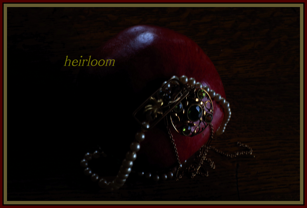
| This seems a bit dark to me. I checked my monitor to view this on the brightest setting, but I still think that a bit more light would have helped this image a lot. Otherwise, I think this is a fine selection of jewelry, good focus, and nice image. |
|
 Photographer found comment helpful. Photographer found comment helpful. |
|
|
11/06/2014 11:20:30 AM |
|
| Photographer found comment helpful. |
|
|
11/03/2014 09:20:45 AM |
| The color scheme is nice, and I like the low-key look, but there's a little motion blur in the photo you used. |
|
| Photographer found comment helpful. |
|
|
11/02/2014 01:27:08 PM |
| To me, this is too dark, although it might work if it had just been the pearls. Not sure what the red object is or why it is included. |
|
| Photographer found comment helpful. |
|
|
11/01/2014 09:59:30 PM |
I don't like the border.
I do like the mood.
Is that a potato the jewelry is on?
I think the text should be more subdued to match the mood. As is, it competes against the jewelry for my attention (and wins).
7 |
|
| Photographer found comment helpful. |
|
|
11/01/2014 03:00:58 PM |
| Can barely tell what I'm looking at the image is so dark and underexposed. |
|
| Photographer found comment helpful. |
|
|
10/31/2014 05:15:32 PM |
|
| Photographer found comment helpful. |
|
|
10/31/2014 01:17:24 PM |
| The border/s do this in, in my view. |
|
| Photographer found comment helpful. |
|
|
10/31/2014 01:13:30 PM |
|
| Photographer found comment helpful. |
|
|
10/31/2014 08:12:23 AM |
| coming in a bit dark on my screen but nice idea |
|
| Photographer found comment helpful. |
Home -
Challenges -
Community -
League -
Photos -
Cameras -
Lenses -
Learn -
Help -
Terms of Use -
Privacy -
Top ^
DPChallenge, and website content and design, Copyright © 2001-2025 Challenging Technologies, LLC.
All digital photo copyrights belong to the photographers and may not be used without permission.
Current Server Time: 03/10/2025 09:03:13 AM EDT.