| Author | Thread |
|
|
02/09/2003 08:57:29 AM |
Critique Club
Compositon:
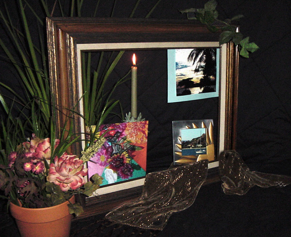
For composition I look for several rules that may apply from S or L shape Composition to Rule of Thirds and Golden Mean. It appears that there is a base of L composition in this photo due to the photos on the frame as well as a Rule of Thirds inside the frame as well. After thinking about it it seems as thought you used the entire frame well.
Subject Selection:
I do feel that there is a sense of clutter distraction. I am not too sure what is is front of the picture frame. This computer I am using to view your shot is not mine so it seems a bit dark and there is no way to fix it. When I return home from my trip I will re-look at your photo and add or subtract from my original critique.
Overall Critique.
I will say that it appears dark and that it may appear a little cluttered, but I can not see certain things in the shot that were meant to be seen and I appologize for that since I am limited. Composition itself utilizes many forms and I think you did well with that. I consider this a 4.5 to 5.0 photo as is. With a little tweaking I would hang this on my wall.
John (TurboTech) |
|
Comments Made During the Challenge  |
|
|
02/01/2003 12:15:32 PM |
| Too much "stuff" in this photo. |
|
|
|
02/01/2003 06:01:06 AM |
Composition: Good
Technical: The focus seems good, but this pic is very dark for me. I can't tell what the subject is bottom-right, which I assume I should be able to.
Meets challenge: Push it a little..
Overall impression: With more contrast could have been much better. 4 |
|
|
|
01/30/2003 04:43:15 PM |
| Nice composition. Uniquet. Just a little too dark for me. Would like for the frame to stand out a little more. But still a good photo. |
|
|
|
01/29/2003 08:03:11 PM |
| Good creativity, but I think there is too much going on in this photograph. |
|
|
|
01/27/2003 01:25:35 PM |
|
Home -
Challenges -
Community -
League -
Photos -
Cameras -
Lenses -
Learn -
Help -
Terms of Use -
Privacy -
Top ^
DPChallenge, and website content and design, Copyright © 2001-2025 Challenging Technologies, LLC.
All digital photo copyrights belong to the photographers and may not be used without permission.
Current Server Time: 03/12/2025 06:53:39 PM EDT.