| Author | Thread |
|
|
02/06/2003 10:56:17 PM |
...from Critique Club...
Hi Van
FIRST IMPRESSION:
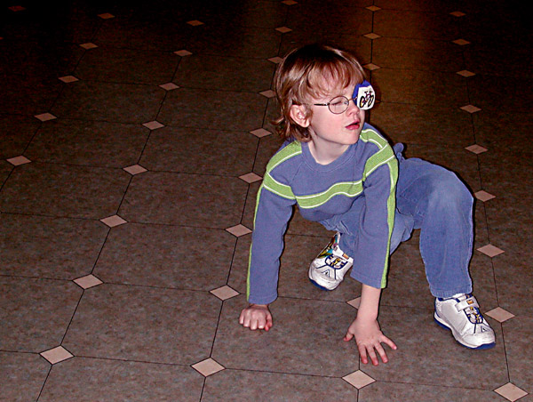
Very snapshot looking.
COMPOSITION:
Very good. Subject placing is good, the only thing I would so is move to the left so that the tiles align with the bottom border (horizontal) :)
TECHNICAL:
I think your low votes came from your technical execution. As soon as you use a onboard flash, you are doomed! This will almost always make it look like a casual snapshot. I suggest you use other lighting (mounted lamp, window, sun) to make your shots more dramatic. Looking at your other photos, I think this was a last minute thing and it's more about the story behind it than the actual photo :|
ARTISTIC:
N/C :)
OVERALL:
I know you can do better...you have done better...CONGRATS ON THE NEW MEMBER OF THE FAMILY!!!!!!!!
Cheers and good luck in the future challenges. |
|
 Photographer found comment helpful. Photographer found comment helpful. |
|
|
02/03/2003 03:55:59 PM |
| Cute shot, however it looks like you were outside the date bounderies; the picture must be taken during the week of the challenge. |
|
Comments Made During the Challenge  |
|
|
02/01/2003 02:02:01 PM |
| Cute kid. What is all over his fingers that is red? Indirect light would have lighten the background without washing it out. Still not bad at all. |
|
| Photographer found comment helpful. |
|
|
01/29/2003 08:10:38 PM |
| I see the squares on the floor, but the subject of the photo is not a square (unless that's what you're implying). Basically, this is a snapshot. |
|
| Photographer found comment helpful. |
|
|
01/28/2003 02:31:35 AM |
| I like your idea here! Quite original! Did he find the square yet? |
|
Home -
Challenges -
Community -
League -
Photos -
Cameras -
Lenses -
Learn -
Help -
Terms of Use -
Privacy -
Top ^
DPChallenge, and website content and design, Copyright © 2001-2025 Challenging Technologies, LLC.
All digital photo copyrights belong to the photographers and may not be used without permission.
Current Server Time: 03/12/2025 08:24:28 PM EDT.