| Author | Thread |
|
|
02/09/2003 02:52:18 AM |
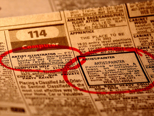
HEY! As far as taking a shot of the want ads goes... this is great. As far as taking a great window shot though... Call me old fashioned, but I kind of thought this one was pretty straightforward. :P It's a little hard to look at b/c of the dof and the bright red circles. This looks a little like a stock art shot or something you'd see in a corporate report. There is a market for it. Technically it's good ... just can't compete with some of the artistic shots as far as the popular vote goes.
Here are some thoughts from annida who's helping me out with a few critiques:
An interesting interpretation of the challenge! I think it didn't do well mainly because it seemed like it was mostly off the point of the challenge, but I can understand where you were coming from.
I like the way you can read the text really well on the ones which you've circle.. I just wish that you could have done it without the red circles!
I wonder if that's possible? I like the blur of the letters which you're not supposed to read; although a bit is distracting with the fact that you can read it.
It kind of hurts my eyes sitting here and staring at it, which isn't a really bad thing, it just makes me wanna strain my eyes to read more of it.
Maybe a different angle, or focusing on the one advertisement on the left which is the one which is the most in focus. I would have also tried to make the rest of the newspaper a touch darker to frame the advert.
It is a good idea, and I think it would really work with a bit more revision!
|
|
Comments Made During the Challenge  |
|
|
02/02/2003 10:41:47 PM |
| i love this take on the challenge! great shot...perfect focus and depth of field. excellent work! |
|
|
|
02/02/2003 08:06:15 PM |
| Gotta be honest- I'm not much on this "alternative" interpretation. That aside; I like the sepia tone, and really like the blur, so that your circled areas really stand out. I would have preferred to see newspaper throughout the photo - the area above the folded edge of the paper looks like it is not part of the paper, and I find it a little distracting. I like the way you composed the paper in the frame (at an angle like it's laying on a table), I think a lot of people would have been tempted to take a straight-on shot (holding the paper up in front of the camera). |
|
|
|
02/02/2003 05:38:50 PM |
| This takes second place for creativity, only because you've really stretched it to fit the challenge. But then I like imagination. Why such a yellow paper? Nice depth. Good focus. well done - even though it is quite a stretch. |
|
|
|
02/02/2003 11:54:50 AM |
| Nice DOF. As far as a photo of newsprint goes, it's a good photo. The interpretation of the challenge is good, I like metaphor. But the photo doesn't grab me as a whole. |
|
|
|
01/29/2003 04:15:23 PM |
| Very well taken shot, narrow DOF works very well in this case. This is a wildly different "take" on the challenge topic (so creative in that respect), but visually, not that appealing. 6 Swash |
|
|
|
01/29/2003 11:38:23 AM |
| Great job thinking out of the box! Yet the picture does not do much for me personally. Bonus point though for your creativity. (7) John Gill |
|
|
|
01/28/2003 01:05:52 AM |
| great focus on the ads.. I think I would like it better black and white though, like a newspaper.. the yellow gives it a phone book look |
|
|
|
01/27/2003 04:18:17 AM |
| Hehe.. A truly creative solution to the problem. I played around with a few goofy puns on "window" and "door" as well, but this is better than anything I could come up with. Artistically, the limited DOF and the selected sharpness (or is it Photoshop? ;) really does it for me. (9) |
|
|
|
01/27/2003 12:44:58 AM |
|
Home -
Challenges -
Community -
League -
Photos -
Cameras -
Lenses -
Learn -
Help -
Terms of Use -
Privacy -
Top ^
DPChallenge, and website content and design, Copyright © 2001-2025 Challenging Technologies, LLC.
All digital photo copyrights belong to the photographers and may not be used without permission.
Current Server Time: 04/28/2025 03:28:26 AM EDT.