| Author | Thread |
|
|
02/09/2003 02:01:39 AM |
with a little help from annida:
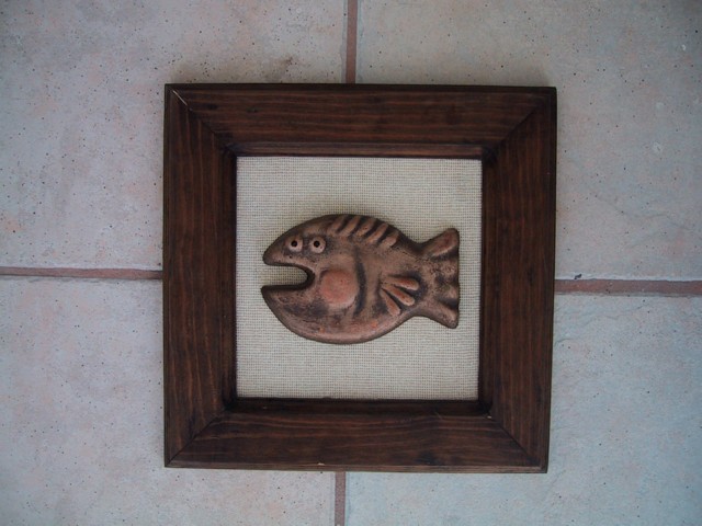
I like the idea of this picture very much. The subject is appealing, and definitely fits the challenge of square. What I think you could have done to improve the composition was to a) either put a fabric behind the frame, so it's not on the tile, or b) cropped the picture so that it was actually around the frame, which would result with a square photo as well. I think a bit more lighting on the subject would have been good as well. Maybe you could have tried a duotone, since the colouring is almost there already, and made the contrast more, with some sharpening and use of curves. I think this is a very good attempt, and I hope to see more from you in the future! |
|
Comments Made During the Challenge  |
|
|
02/02/2003 08:28:11 AM |
| lol, that's a funny lookin' fish. Cute shot. the light seem pretty dark, you might to brighten it up in Photoshop/Päintshop Pro. Good luck. |
|
|
|
02/02/2003 12:18:04 AM |
| Feels unlevel. A cute photo though. |
|
|
|
02/01/2003 12:58:09 PM |
|
|
|
02/01/2003 04:08:34 AM |
|
|
|
01/31/2003 07:02:49 PM |
| Fun photo - I like how it was centered. |
|
|
|
01/31/2003 02:17:12 PM |
| I like your fish. Although it does take the focus off the rest of your picture. |
|
|
|
01/31/2003 01:43:13 PM |
| Interesting subject..and i really like the all around balance created, Good Job. |
|
|
|
01/30/2003 04:20:55 PM |
| Very nice and clear photo. Although, I feel that this photo isn't very creative for the concept of squares. Good job |
|
|
|
01/30/2003 02:33:52 PM |
Composition: Think a different drop would be nice
Technical: Good focus. Little dark? Looks slightly unstraight?
Meets challenge: Yes
Overall impression: Nice picture, but not sure photo adds to it |
|
|
|
01/30/2003 12:52:15 AM |
| Funny figure. Maybe should have played with some coloring. Needs some sort of tone, those tiles don't help much (unless you add some sort of tone, then they add texture). |
|
|
|
01/29/2003 10:25:37 AM |
| your image is very nice, i like the tiles areound it |
|
|
|
01/29/2003 08:55:08 AM |
| This this would be more effective if the lines running across the image were level. jgillard5 |
|
|
|
01/28/2003 08:43:56 PM |
|
|
|
01/28/2003 01:36:42 PM |
| Funny title, good shot, little dark. |
|
|
|
01/28/2003 07:26:16 AM |
| I have the urge to try and straighten up your picture! The diffuse lighting is a good idea, but it seems a little dark, or lacking contrast, to me. |
|
|
|
01/28/2003 06:23:50 AM |
| Simple!! I like it very much! The title made this photo very special!! |
|
|
|
01/27/2003 05:55:50 AM |
|
|
|
01/27/2003 03:04:49 AM |
|
Home -
Challenges -
Community -
League -
Photos -
Cameras -
Lenses -
Learn -
Help -
Terms of Use -
Privacy -
Top ^
DPChallenge, and website content and design, Copyright © 2001-2025 Challenging Technologies, LLC.
All digital photo copyrights belong to the photographers and may not be used without permission.
Current Server Time: 03/12/2025 05:54:42 PM EDT.