| Author | Thread |
Comments Made During the Challenge  |
|
|
11/02/2004 02:06:01 PM |
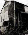
| Nice composition & sepia tone. |
|
|
|
11/01/2004 09:19:50 PM |
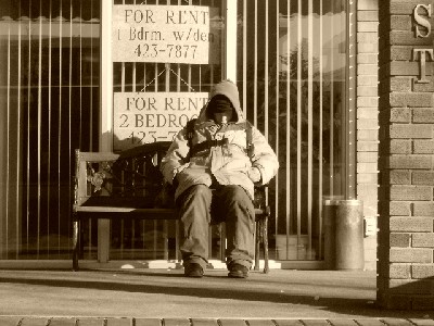
| I sure wish this was bigger, I like the idea a lot, just can't really get a good grasp on it |
|
|
|
11/01/2004 12:13:01 PM |
Sepia is a good choice here. I would prefer to see the guy moved more to the left or right. (rule of thirds) as this would certainly help with the composition.
I also find the image a little to small to really see what is going on here. |
|
|
|
11/01/2004 09:47:48 AM |
| Like the sepia. Subject too centered for my taste. If you could cropped it to the left and get rid of that pole (wall) would be better IMO. Than the size is too small to judge it correctly |
|
|
|
10/31/2004 03:03:42 PM |
| makes me cold and depressed to just see this guy. Good illustration of poverty. |
|
|
|
10/30/2004 08:10:58 PM |
| I just wish the picture was bigger and more cropped in on the subject so you could see the details of their face. |
|
|
|
10/30/2004 07:02:54 PM |
| I think this would have been stronger if you were closer to the person. |
|
|
|
10/30/2004 12:42:40 AM |
| would help if picture was a little bigger. It's a good picture, however. I like the sepia tone, and the composition... |
|
|
|
10/28/2004 01:45:32 PM |
| I like the colour and lighting, feels a bit too set-up. The clothing and shoes look too clean for true representation of the subject. However, it does convey the expected look for Poverty. Good Luck. |
|
|
|
10/28/2004 12:57:46 PM |
| confusing title since the signs are advertising available rooms. . . |
|
|
|
10/28/2004 08:42:55 AM |
| compestion not good try diffrent crop. |
|
|
|
10/27/2004 09:53:36 PM |
|
|
|
10/27/2004 04:41:19 PM |
| A homeless man in front of signs selling homes that he can not afford. That is poverty. And I like the black and white, I get the feeling this image would not have worked nearly as effectivly in color. |
|
|
|
10/27/2004 03:01:41 PM |
| A little small and perhaps a bit more cropping needed. |
|
|
|
10/27/2004 06:15:02 AM |
| nice photo, it would have been nice to crop it a little tighter on the person. |
|
|
|
10/27/2004 04:36:20 AM |
| I get to ask questions . who what and why he has ended up here. a perceptive image. |
|
Home -
Challenges -
Community -
League -
Photos -
Cameras -
Lenses -
Learn -
Help -
Terms of Use -
Privacy -
Top ^
DPChallenge, and website content and design, Copyright © 2001-2025 Challenging Technologies, LLC.
All digital photo copyrights belong to the photographers and may not be used without permission.
Current Server Time: 03/14/2025 03:56:15 PM EDT.