| Author | Thread |
Comments Made During the Challenge  |
|
|
01/31/2003 01:09:13 PM |
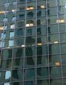
| Nice concept. The focus and subject of the photo is a negative space. It really draws your attention to the middle. This was one of my favorites. |
|
|
|
01/30/2003 02:31:19 PM |
| This photo is placed badly. I like the contrast of black and white. |
|
|
|
01/28/2003 07:36:47 PM |
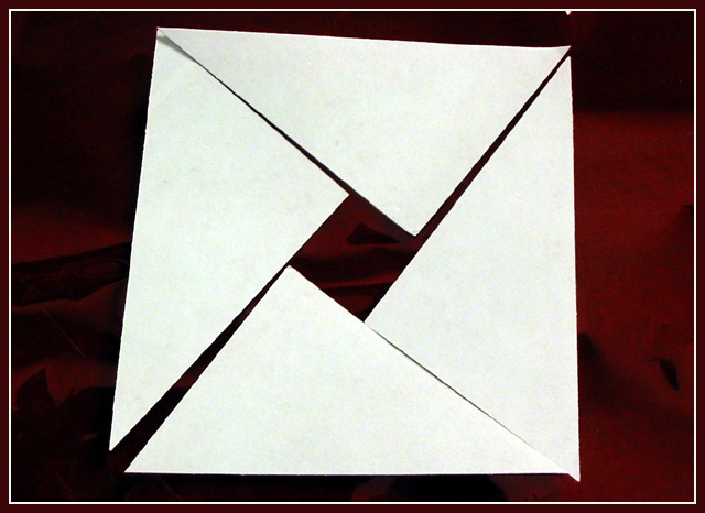
| I really like the background contrasted with the square. |
|
|
|
01/28/2003 01:33:00 PM |
|
|
|
01/27/2003 08:25:25 PM |
| best interpretation yet. let down by noise in the white, or maybe you shopuld have used a higher grade of white paper, but there seems to be a brownish tinge to it./ |
|
|
|
01/27/2003 02:31:25 AM |
| I'm not a mathematician, so I'll have to take your word for it. |
|
Home -
Challenges -
Community -
League -
Photos -
Cameras -
Lenses -
Learn -
Help -
Terms of Use -
Privacy -
Top ^
DPChallenge, and website content and design, Copyright © 2001-2025 Challenging Technologies, LLC.
All digital photo copyrights belong to the photographers and may not be used without permission.
Current Server Time: 03/14/2025 04:59:25 PM EDT.