| Author | Thread |
|
|
02/08/2003 11:03:18 PM |
Critique Club
Looks a bit jpeg'd or over compressed like you a) didnt shoot at your camera's highest quality, b) not highest res, c) over compressed after saving.
I like the effect of the building repeated in the building. I tried some similar effects myself for the other challenge but did not submit them.
Still not sure if I like the tilt but if you do, go for it ! |
|
 Photographer found comment helpful. Photographer found comment helpful. |
Comments Made During the Challenge  |
|
|
01/30/2003 03:50:14 PM |
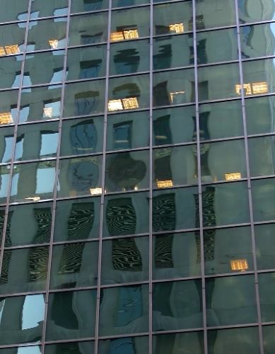
Composition: Should light blue reflections be nearer the left-hand third line?
Technical: Some vertical window frames look jagged. Rescale issue?
Meets challenge: Yes
Overall impression: Would be really good if it was slightly more vibrant. 6 |
|
| Photographer found comment helpful. |
|
|
01/29/2003 08:11:52 PM |
I like how everything in the photograph is squares, well done.
|
|
| Photographer found comment helpful. |
|
|
01/29/2003 09:59:22 AM |
| your photo is nice but windows are a commoly shot subject. you shuld challenge yourself some more |
|
|
|
01/27/2003 10:42:11 PM |
| Nice photo. I tried a similar idea. Hope you're doing better than me ;) |
|
| Photographer found comment helpful. |
|
|
01/27/2003 05:29:07 AM |
I find the picture a little too busy. My attention is drawn more to the reflections than the squares
|
|
Home -
Challenges -
Community -
League -
Photos -
Cameras -
Lenses -
Learn -
Help -
Terms of Use -
Privacy -
Top ^
DPChallenge, and website content and design, Copyright © 2001-2025 Challenging Technologies, LLC.
All digital photo copyrights belong to the photographers and may not be used without permission.
Current Server Time: 03/14/2025 02:19:49 PM EDT.