| Author | Thread |
|
|
02/08/2003 10:48:55 PM |
Critique Club
In this image, colors and textures are excellent. Details is excellent and exposure is very good.
However, compositionally, I wonder if there might be a way to inject some more movement or interest. We have a pattern but what is the context? what is the story? what is there about this subject to offer us an emotional connection to the picture such that we care or think about it ?
Those are some of the things one can consider when working on a photo...You've obviously mastered technique, but now think a little bit more about what you want your pictures to 'say'. |
|
 Photographer found comment helpful. Photographer found comment helpful. |
Comments Made During the Challenge  |
|
|
02/01/2003 11:12:41 PM |
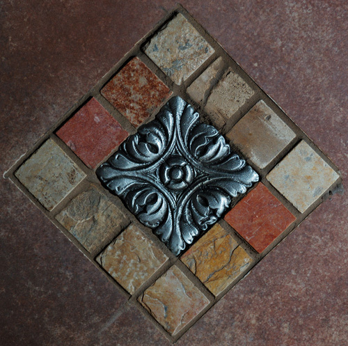
| Beautiful inlay. Love the texture, which is so clear. Might have been lighter but not necessary. Nice composition with good execution. |
|
| Photographer found comment helpful. |
|
|
02/01/2003 05:06:38 AM |
| Neat colors. Reminds me of a tile pattern. Cool center tile though. - Inspzil |
|
|
|
01/30/2003 10:44:20 PM |
| Great color, texture and focus. I'm just not sure I like the way it is centered though. |
|
| Photographer found comment helpful. |
|
|
01/30/2003 03:09:09 PM |
Composition: Good choice of 'diamond' composition
Technical: Good focus/colours. Bit dark?
Meets challenge: Yes
Overall impression: Really good pic, but it's missing interest slightly for me. 6 |
|
| Photographer found comment helpful. |
|
|
01/30/2003 02:44:40 PM |
| This picture is too dark. I like the texture in the photo. |
|
| Photographer found comment helpful. |
|
|
01/30/2003 09:43:41 AM |
| Good detail, nice crop, well done! |
|
|
|
01/30/2003 02:11:59 AM |
| Technically, more than 14 squares but I get your point! Nice crisp definition and warm colours. Lovely shot. |
|
| Photographer found comment helpful. |
|
|
01/29/2003 08:47:34 PM |
| Nice photo of the metal object - no glare!! Like the colors and detail of the tile. |
|
| Photographer found comment helpful. |
|
|
01/29/2003 10:05:33 AM |
| Good work, there is very little negative space in your image. Good job. |
|
|
|
01/28/2003 01:31:28 PM |
| Marble or stone? Pretty. Seems a bit dark. |
|
| Photographer found comment helpful. |
|
|
01/27/2003 12:47:44 PM |
There seemed to be a lot of pictures similar to this one this week, but yours stood out to me. I think the first thing that caught my eye was your use of vivid colors. I enjoy the interaction between the reds in the bricks and the blue in the center tile. This picture has strong lines that draw my attention into the frame no matter which side I start from. I also enjoy the texture in the bricks and center tile. The lighting you used here works well. For me this is one of the strongest pictures in the challenge. I found it difficult to make “square” to be interesting, but I think you have done it here.
Greg
|
|
| Photographer found comment helpful. |
|
|
01/27/2003 09:42:41 AM |
| Nice photo. Initially, I thought that it may have looked better a little brighter, but I actually like the subtle tones. It's a great shot. |
|
| Photographer found comment helpful. |
|
|
01/27/2003 02:34:02 AM |
| It's way to under exposed. |
|
| Photographer found comment helpful. |
Home -
Challenges -
Community -
League -
Photos -
Cameras -
Lenses -
Learn -
Help -
Terms of Use -
Privacy -
Top ^
DPChallenge, and website content and design, Copyright © 2001-2025 Challenging Technologies, LLC.
All digital photo copyrights belong to the photographers and may not be used without permission.
Current Server Time: 03/12/2025 08:56:50 PM EDT.