| Author | Thread |
|
|
12/09/2015 06:14:58 PM |
Greetings from the Critique Club!
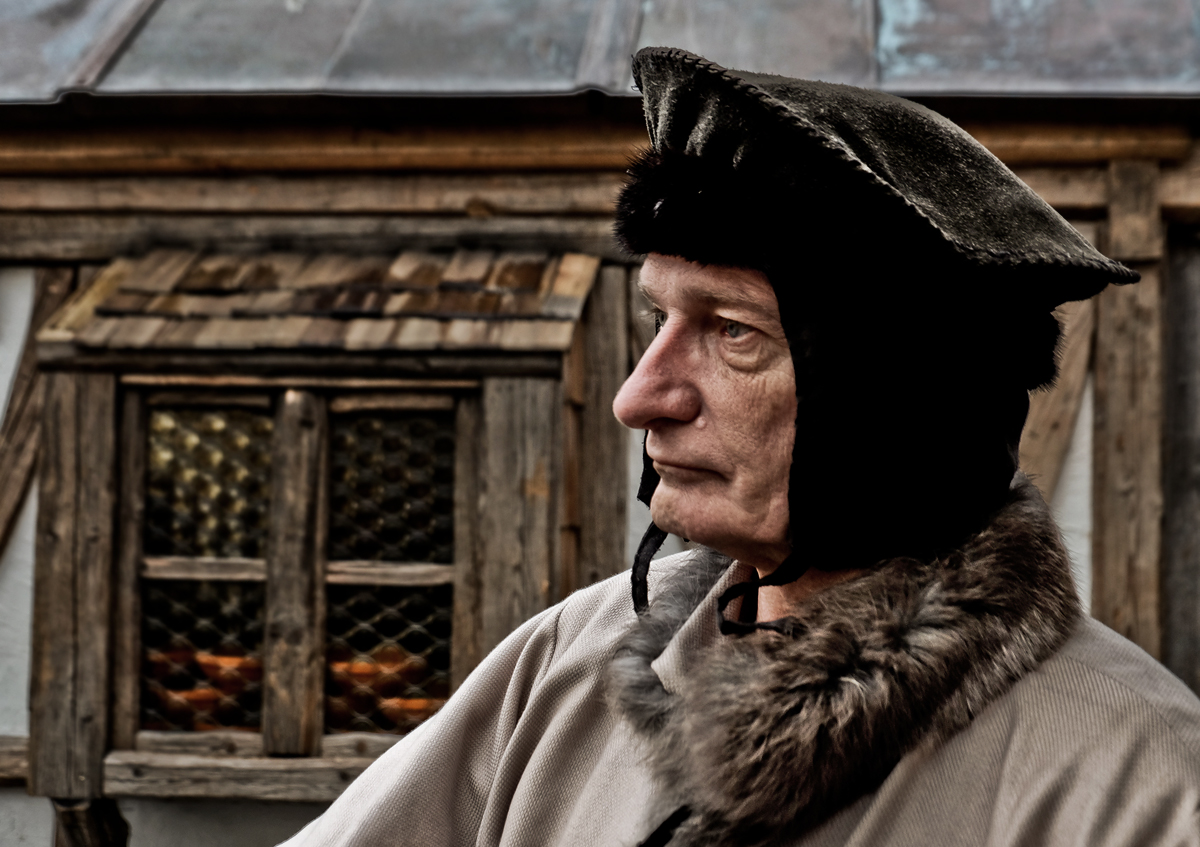
Very nice portrait, your subject has an interesting face and the muted tones of the bg and his clothes don't detract from him. Looks like he should be in an Old Dutch Masters painting. Nice soft ambient lighting. I'm a sucker for rustic stuff like this. The composition is appealing, you've given him plenty of room all around but most importantly, in front of him so he has some space to stare into :-) The bokeh is lmost invisible, with the slightly oof foreground shoulder betraying itself once you see the other shoulder.
The only thing I don't like is the hat eating his face. It's black, clearly a matte material like wool, and maybe there wasn't much to work, with but it would have been nice to see some hints of the shape of his head below. Still, just a minor nitpick, but I have to find something to whine about! :-O
Feel free to PM me with any questions
Susan |
|
 Photographer found comment helpful. Photographer found comment helpful. |
Comments Made During the Challenge  |
|
|
12/08/2015 09:52:44 PM |
| Like you took a little trip in a time machine |
|
| Photographer found comment helpful. |
|
|
12/06/2015 10:13:58 PM |
|
| Photographer found comment helpful. |
Home -
Challenges -
Community -
League -
Photos -
Cameras -
Lenses -
Learn -
Help -
Terms of Use -
Privacy -
Top ^
DPChallenge, and website content and design, Copyright © 2001-2025 Challenging Technologies, LLC.
All digital photo copyrights belong to the photographers and may not be used without permission.
Current Server Time: 03/10/2025 07:10:58 PM EDT.