| Author | Thread |
|
|
04/30/2002 01:45:00 AM |
| thanks everyone that provided comments. I appreciated all the comments and look forward to putting some in practice. |
|
Comments Made During the Challenge  |
|
|
04/28/2002 10:30:00 PM |
| How about in the mouth next... I like the idea. Well executed too. |
|
|
|
04/28/2002 07:07:00 PM |
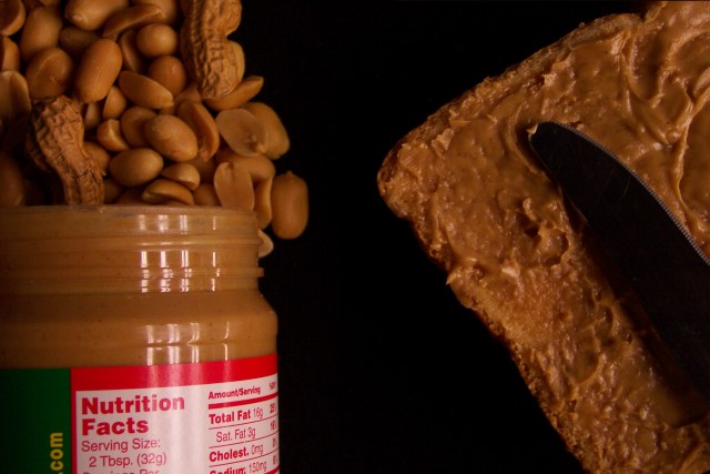
| this is a great idea, except that the dark area in the middle splits the photo into two. |
|
|
|
04/28/2002 06:40:00 PM |
| the image is a little dark and it could use some sharpening to make the detail stand out! |
|
|
|
04/28/2002 11:31:00 AM |
| The setup for this shot seems worthy of better lighting. Nice idea, though. |
|
|
|
04/27/2002 04:02:00 PM |
| Just a little dark. I can barely tell where the knife ends and it's shadow starts. |
|
|
|
04/27/2002 01:14:00 PM |
| a personal favorite (picture and food) :-) I like the way you set this shot up on the black background. 10 |
|
|
|
04/27/2002 10:17:00 AM |
| I'm a little disapointed that its smooth and not crunchy peanut butter! Very original idea, I like it. |
|
|
|
04/26/2002 06:53:00 PM |
|
|
|
04/26/2002 05:28:00 PM |
| It's a very interesting picture but I think it is a little too symmetrical. Maybe if the bread with the peanut butter filled the entire background. Just a thought. |
|
|
|
04/25/2002 04:51:00 PM |
| Another fine example of transition |
|
|
|
04/24/2002 05:53:00 PM |
| What a great idea! Would make a lovely advertisement for somebody. One of my favorites. |
|
|
|
04/24/2002 04:21:00 PM |
| if this was brighter, it could be a professional commercial for peanut butter! nice imagination. |
|
|
|
04/23/2002 11:50:00 PM |
| I KNEW they put the shells in too! Interesting idea. Maybe a bit more light, and contrast, but very nice. |
|
|
|
04/23/2002 10:08:00 PM |
| I like the addition of the full peanuts to the peanut halves in front of the peanutbutter jar. I think this might be a little too close. Too much black space in my opinion. |
|
|
|
04/23/2002 08:29:00 PM |
| great concept, great colors. |
|
|
|
04/23/2002 08:15:00 PM |
| Love the concept and execution. Nice! |
|
|
|
04/23/2002 09:36:00 AM |
| what!? no brand name? ;o) clever, i like it |
|
|
|
04/23/2002 09:32:00 AM |
| good transition, dark background suits |
|
|
|
04/23/2002 03:58:00 AM |
| was there no way to not have the label from the jar in the picture? its a bit distracting, especially the green bit! Great idea, but would have perhaps worked better without the splash of colour in the corner? Guess its down to personal preference. Nice picture. |
|
|
|
04/22/2002 09:12:00 PM |
| too artificial in my opinion |
|
|
|
04/22/2002 09:08:00 PM |
| Nice Shot!! I like it... I don't like peanuts or peanut butter either but if i did, i'd be headin down to make me a sammich right now! |
|
|
|
04/22/2002 08:03:00 PM |
|
|
|
04/22/2002 07:46:00 PM |
| I didn't realize peanut butter had that much fat....Nice one. You showed quite a transition. |
|
|
|
04/22/2002 07:19:00 PM |
| Pass the jam ...... Im hungry |
|
|
|
04/22/2002 04:58:00 PM |
| Almost too dark for me... Would like to see a different side of the label on the peanut butter. |
|
|
|
04/22/2002 04:53:00 PM |
| Much more creative than flowers and leaves. |
|
|
|
04/22/2002 04:26:00 PM |
| This is GREAT. Alot of thought and effort went into this picture. I wish it was a little brighter but it's great! |
|
|
|
04/22/2002 04:22:00 PM |
| This one makes me hungry just looking at it, I like the composition, the black background is great, I also like the 2 nuts in the shells, a couple more wouldn't have hurted |
|
|
|
04/22/2002 02:18:00 PM |
LOL great idea!
Just a little dark but nice work. |
|
|
|
04/22/2002 01:41:00 PM |
| nicely done, the knife appears too dark, though, maybe. |
|
|
|
04/22/2002 10:27:00 AM |
| you ought to put more peanut butter on your bread! ;-) I like how it kind of looks like an ad |
|
|
|
04/22/2002 10:19:00 AM |
| good setup for this still life. reflections on the jar are spoiling it though. Light in general needs some work, as the knife is too dark |
|
|
|
04/22/2002 08:54:00 AM |
| Is this transition or just different forms? |
|
|
|
04/22/2002 08:47:00 AM |
| Great composition, but maybe more light would be beneficial. Good shot though. |
|
|
|
04/22/2002 08:11:00 AM |
| Nicely done. The tight crop clearly defines the transition. |
|
|
|
04/25/2002 01:18:00 PM |
|
|
|
04/25/2002 12:53:00 PM |
| Since you can't see the surface below, on first glance this looks like two photos composited! I'd have angled the knife the other way to catch the light. Good thinking! |
|
|
|
04/23/2002 01:24:00 PM |
| nice idea, but it's dark -- the knife looks like a piece of black plastic -- not tableware (although, maybe it is a picnic knife, I don't know) |
|
|
|
04/22/2002 02:32:00 AM |
| 16 grams of fat! Maybe you should have taken a pic of your gut growing! Kidding aside, nice idea and well executed. |
|
Home -
Challenges -
Community -
League -
Photos -
Cameras -
Lenses -
Learn -
Help -
Terms of Use -
Privacy -
Top ^
DPChallenge, and website content and design, Copyright © 2001-2025 Challenging Technologies, LLC.
All digital photo copyrights belong to the photographers and may not be used without permission.
Current Server Time: 03/12/2025 09:04:17 AM EDT.