Greetings from the Critique Club!
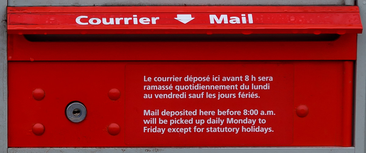
Hah, I guess this was a work of Marcel :-) Nice true Canada Post red on the mailbox, the obligatory bilingual lettering, great focus, the settings are perfect for this capture...so what held it back?
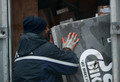
I think that the lack of both size, space and human interaction of some sort are what stopped this image from doing better. Voters like to see a story and though you meant to show it as a letter starting its journey, the idea would have been better conveyed with a hand inserting the envelope into the mailbox. Look at the winning entry and I think all you see is a hand, but it's part of a person, and so we can all relate to going to the mailbox and reaching in to get whatever's there, be it a bill (ugh) or a Christmas card from a loved one.
Dare I say that this shot almost has a corporate feel to it, like CanPost paid you to take it; the very small size of it on the short side and lack of showing anything else going on around it. Is this inside a building or out on the street somewhere? We don't know, there isn't enough of the space around it to show us and give us some sense of place and story.
Hope this helps and keep up the good work,
Susan |