| Author | Thread |
|
|
01/21/2016 07:03:52 PM |
Greetings from the Critique Club!
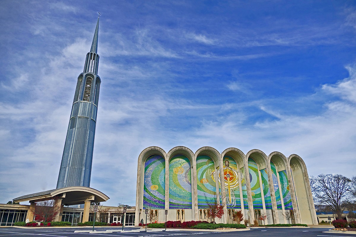
I gave this a 6 in voting partly cause I'm a suckah for wide-angle stuff, and because I could see you put some effort into it. Again I can see lots of the same kind of mistakes I made. Like the edge of the church spire looks jagged - that usually means a little too much sharpening has been going on. There is a way to reduce the amount of sharpening you do, so you can still get the best of what sharpening can do without overdoing it.
I would watch for things like the glow around the cross atop the church; the fact that you used this church and a religious mural should do all the talking for you. Adding the glow seems to me belabouring the point.
Colours are good, look a little saturated but not overly so. The lack of human activity is both good and bad because this has a bit of an abandoned feel to it with no people there; but nor did you want to shoot just a parking lot full of cars.
Keep on shooting and entering!
Susan |
|
 Photographer found comment helpful. Photographer found comment helpful. |
Comments Made During the Challenge  |
|
|
01/01/2016 12:27:01 PM |
| my favorite in this challenge -- well done! |
|
| Photographer found comment helpful. |
|
|
12/30/2015 09:13:58 AM |
|
| Photographer found comment helpful. |
Home -
Challenges -
Community -
League -
Photos -
Cameras -
Lenses -
Learn -
Help -
Terms of Use -
Privacy -
Top ^
DPChallenge, and website content and design, Copyright © 2001-2025 Challenging Technologies, LLC.
All digital photo copyrights belong to the photographers and may not be used without permission.
Current Server Time: 04/25/2025 10:38:51 AM EDT.