| Author | Thread |
|
|
07/29/2016 08:40:38 PM |
Greetings from the Critique Club!
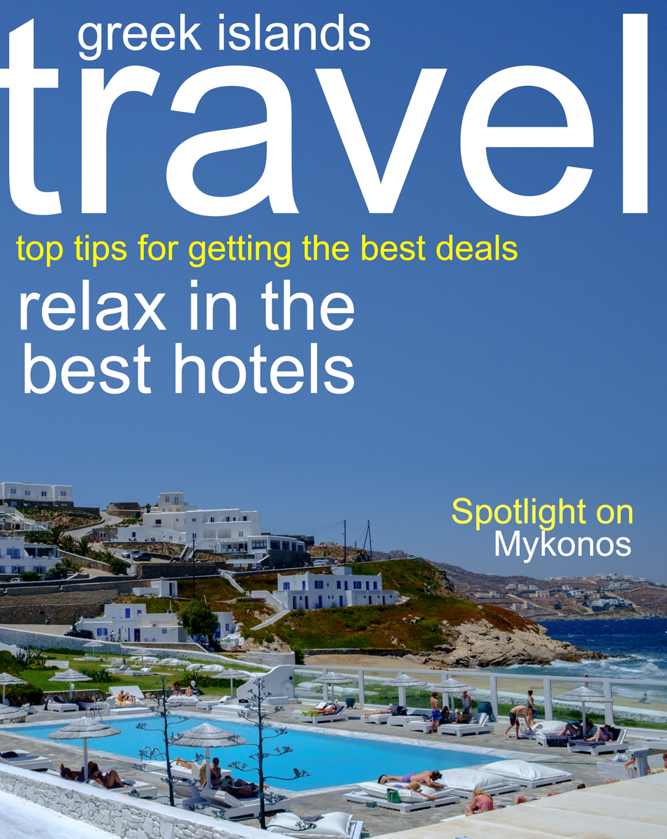
I really liked this shot, I gave it a 7 in voting :-) Very simple layout, the white sans-serif font works well, the message is quite simple and there. The photo of Mykonos is straightforward tourist-destination fodder, but it does the job and the blue water of the pool plays of well against the ocean and the sky.
The one thing I don't like are the utility poles about halfway up the image. They and the wires hanging off of them are dark and thus stand out in contrast to the nice lines, white houses and blues in the picture.
To be really nitpicky, I would suggest using the Rulers tool to help align the type a bit better...there is a gutter of blank space on the title, but the crossbar on the 't' of the word 'travel' is flush left against the side of the image. You need to leave a gutter of room there too.
Otherwise, your settings make perfect sense as you shot handheld and when the light was quite high in the sky. Not too much saturation or colour hit, just enough to make everything pop nicely.
Hope this helps!
Susan |
|
 Photographer found comment helpful. Photographer found comment helpful. |
Comments Made During the Challenge  |
|
|
07/04/2016 04:37:47 PM |
|
| Photographer found comment helpful. |
Home -
Challenges -
Community -
League -
Photos -
Cameras -
Lenses -
Learn -
Help -
Terms of Use -
Privacy -
Top ^
DPChallenge, and website content and design, Copyright © 2001-2025 Challenging Technologies, LLC.
All digital photo copyrights belong to the photographers and may not be used without permission.
Current Server Time: 04/11/2025 03:05:56 PM EDT.