| Author | Thread |
Comments Made During the Challenge  |
|
|
11/15/2004 06:15:03 PM |
|
|
|
11/14/2004 05:32:44 AM |
| a little too tight the crop, specially on the right hand side, looks like you left some of the subject out even tho you actually didn't. |
|
 Photographer found comment helpful. Photographer found comment helpful. |
|
|
11/13/2004 01:31:00 AM |
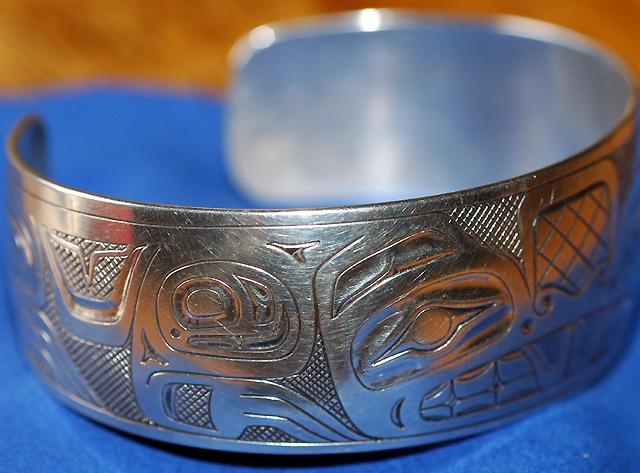
| The dual toned background is distracting. Excellent sharpness in this shot. |
|
| Photographer found comment helpful. |
|
|
11/11/2004 07:56:40 AM |
| Nice focus and color. I would have scored it higher if it had been cropped more at the top so the table wasn't showing. |
|
| Photographer found comment helpful. |
|
|
11/11/2004 06:45:06 AM |
| Lovely subject. Blue is a perfect choice for the background, but it would be nice if it filled the space behind. A light tent would help minimize the harsh shadow and hot spots which pull the eye away from the work of interest. |
|
| Photographer found comment helpful. |
|
|
11/11/2004 05:16:44 AM |
| This could be ok if you had taken the time to make the background not so distracting. |
|
| Photographer found comment helpful. |
|
|
11/10/2004 09:02:20 AM |
| The DoF is good, but I dont like the colours all reflecting on the silver. This would look better in B&W I think. |
|
| Photographer found comment helpful. |
|
|
11/10/2004 08:02:14 AM |
| That brown backround is distracting, next time try to have it all in one colour but other than that an allright shot, nothing spectacular though. |
|
| Photographer found comment helpful. |
Home -
Challenges -
Community -
League -
Photos -
Cameras -
Lenses -
Learn -
Help -
Terms of Use -
Privacy -
Top ^
DPChallenge, and website content and design, Copyright © 2001-2025 Challenging Technologies, LLC.
All digital photo copyrights belong to the photographers and may not be used without permission.
Current Server Time: 03/16/2025 10:08:38 PM EDT.