| Author | Thread |
|
|
02/11/2003 06:49:47 PM |
Originally posted by Anachronite:
oh and, yes I am embarrassed |
So you're not going to upload a HiRes TIFF to the print galleries?
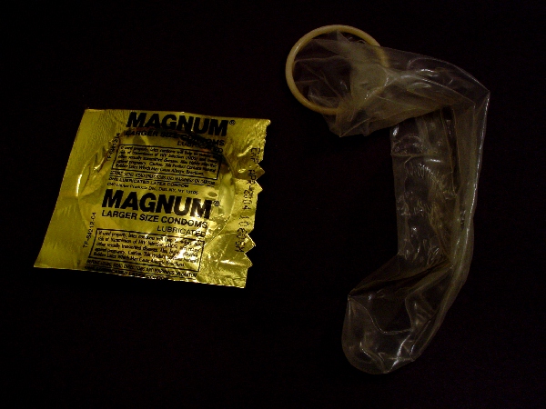
Seriously, so much depends on context. If you prepped that as a poster with the same caption it would not seem too out of place in a STD or family planning clinic, now would it? |
|
 Photographer found comment helpful. Photographer found comment helpful. |
|
|
02/11/2003 10:09:06 AM |
Did you ever play Hearts as a kid, the card game. When it looks like you are getting a poor score you try to "Shoot the Moon" which means you try to get ALL the bad points. If you get every one, they turn positive and you win. Looks like you were shooting the moon.
PS _ I had to write a long review of andres Condom photo, I'm glad I didn't pull this one too... |
|
| Photographer found comment helpful. |
|
|
02/10/2003 03:45:42 PM |
| Jeff, you were right, this was on the disgusting side. Last place....now you know what not to do again. How does this fit in with the religious theme we were discussing earlier today? |
|
| Photographer found comment helpful. |
|
|
02/10/2003 12:31:38 AM |
| oh and, yes I am embarrassed |
|
|
|
02/10/2003 12:31:20 AM |
| here's a prime example of what not to do... beer and photography don't mix :o( |
|
Comments Made During the Challenge  |
|
|
02/08/2003 12:44:09 PM |
| Crude... you could have made a much better photo out of an idea like this :P. Try a white background next time. |
|
| Photographer found comment helpful. |
|
|
02/06/2003 11:03:32 AM |
| well...ya had a b&a idea...but not really a good shot of it. you could have at least blown up the balloon and made a donkey out of it or something..pfft. |
|
| Photographer found comment helpful. |
|
|
02/05/2003 11:40:25 PM |
| this looks too dark to me. |
|
| Photographer found comment helpful. |
|
|
02/04/2003 11:55:38 AM |
| out of focus, too dark and honestly a bit ughhhhh! |
|
| Photographer found comment helpful. |
|
|
02/04/2003 10:47:05 AM |
| Looks like you're shootin' blanks :) |
|
| Photographer found comment helpful. |
|
|
02/03/2003 09:28:04 PM |
| You fit the challenge however this is not an overly attractive photo, either compositionally or stylistically. I really don't care for the super dark on the right and the super light on the left, plus your light source shines brightly off the condom package. I would have maybe cropped in more and moved the condom package closer, so that they were almost on top of each other, might make it somewhat more visually attractive. I give you some points for meeting the challenge, and the photo is in focus... -5- |
|
| Photographer found comment helpful. |
|
|
02/03/2003 09:08:11 PM |
| This really needs more lighting. Everything seems so dark. Nice concept. Thank you for not filling up the tip of the condom. lol Good luck. |
|
| Photographer found comment helpful. |
|
|
02/03/2003 03:47:35 PM |
Too Funny! :-)
Bill Miller (wackybill) |
|
| Photographer found comment helpful. |
|
|
02/03/2003 02:34:24 PM |
| gross, crude, and unnecessary. But then that's just my opinion, and you expected it from me. And I didn't want to disappoint you. |
|
| Photographer found comment helpful. |
|
|
02/03/2003 07:26:57 AM |
| Hmmmm... it's empty.... :-( LOL A little under-ex for me |
|
| Photographer found comment helpful. |
|
|
02/03/2003 12:23:11 AM |
|
| Photographer found comment helpful. |
Home -
Challenges -
Community -
League -
Photos -
Cameras -
Lenses -
Learn -
Help -
Terms of Use -
Privacy -
Top ^
DPChallenge, and website content and design, Copyright © 2001-2025 Challenging Technologies, LLC.
All digital photo copyrights belong to the photographers and may not be used without permission.
Current Server Time: 03/14/2025 10:11:21 PM EDT.