CRITIQUE CLUB COMMENT
by karmat
COMPOSITION
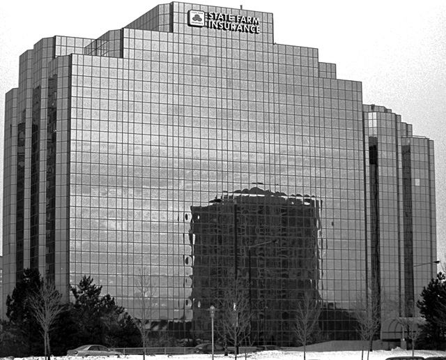
Though you have filled the frame well, it seems a little tight at the top. I think allowing more room at the very upmost point of the building would have given it a roomier feeling without compromising the amount of frame that was filled. I think hte fact that the name of the sign is so close to the top of hte building, and thus, so close to the top of the frame emphasizes that tightness.
Also, would it have been possible to crop out the very bottom, so that the car and snow was not showing? There is just enough there to notice, but not enough to be able to tell if anything is significant to the picture. Maybe if you could have found an angle that didn't include quite so much othe building, it would have more immediate visual appeal.
TECHNIQUE
The black and white works very well with this shot, I think. I am noticing some gray noise in the sky, which makes me tend to think you may have overprocessed or oversharpened. I can either assume that you meant to do it that way, or didn't. :-) If you meant to do it that way, it gives a certain edginess to the picture. If you didn't, you can use a downloadable filter such as NEATIMAGE to clean it up. The focus seems pretty right on, though the noise does make me think that maybe it was slightly out of focus and you used postprocessing to mask that (if that is no the case, I apologize, but others may have thought the same thing).
OVERALL EFFECT
I, like several others, below, wondered how this fit in the challenge, but I gave you the benefit of the doubt, based on reasoning similar to lisae's. A word of caution though, subtle doesn't score well, unfortuntely, especially in an instance like this one where the picture would fit really well in a previous or concurrent challenge.
Like I said the graininess and noise does add a bit of edge to the photo, but it is still difficult to tell if it was intentional or not.
|