| Author | Thread |
Comments Made During the Challenge  |
|
|
11/21/2004 08:36:52 PM |
|
 Photographer found comment helpful. Photographer found comment helpful. |
|
|
11/21/2004 07:26:44 PM |
Invitational Challenge Level: Experienced
Challenge link: strong.
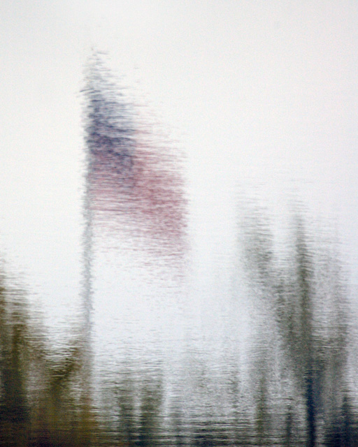
Image critique: it exercises the correct approach for this challenge in my view, but, for want of a better word, it's a bit dull. Colour is just too washed out and the subject not exactly riveting. However, you have attempted impressionism through your photo and not a filter or 'artificial' means so you deserve credit for that.
Out-of-challenge appeal: it's OK but not much to return for.
Score: 6 |
|
| Photographer found comment helpful. |
|
|
11/21/2004 12:13:37 AM |
Interesting take on the challenge.
I fear the patriotism look may hurt a bit from those not in the U.S.
Perhaps a bit to bright & too much negative space for impressionism, but what do I know about it - LOL.
Well Done! ((7)) |
|
| Photographer found comment helpful. |
|
|
11/20/2004 11:30:08 AM |
| Took me a while to realise that this wasn't a blurred random reflection! When the flag 'appeared' it made a whole lot more sense. A bright blue sky would have been nice as it seems a little flat to me as it is. I do tend to prefer very colourful photos though. |
|
| Photographer found comment helpful. |
|
|
11/19/2004 08:24:54 PM |
|
| Photographer found comment helpful. |
|
|
11/19/2004 06:19:59 PM |
IMHO this shot is just a tad to blured, Impressionism tipicaly still allows u to view an image from a coupple feet back sharp and clear but when u get in close u can see that it is nothing more than well placed patches of colour, and brushstrokes.
just seems over done to me thats all. |
|
|
|
11/19/2004 07:04:25 AM |
| seems a bit too gray, very nice ripple and blur effect tho. |
|
| Photographer found comment helpful. |
|
|
11/17/2004 01:04:38 PM |
| Very nice. Abstract and impressionistic at the same time. A bit more saturated red could give more visual appeal maybe? |
|
| Photographer found comment helpful. |
|
|
11/16/2004 10:21:25 PM |
| Non-voting on this challenge but I really like this one. |
|
| Photographer found comment helpful. |
|
|
11/16/2004 06:16:26 PM |
| Bumping to 9. I would have like more definition on the flag especially if you look at it from afar but ... it's impressionism, and it does leaves a huge impression on the reader. |
|
| Photographer found comment helpful. |
|
|
11/16/2004 05:54:38 PM |
| I like this because I wasn't able to tell what it was in the fullsize image, it was looking at it in the thumbnail that I realized it's a flag. Nicely done, good impression :) |
|
| Photographer found comment helpful. |
|
|
11/16/2004 07:04:18 AM |
| I like the soft reflective focus on your image. The filtering is not overpowering. Although not a complicated picture in imagery it is very pleasing to the eye. |
|
| Photographer found comment helpful. |
|
|
11/15/2004 11:39:41 PM |
returning for comments.
very simple and very effective to produce a very subtle effects. My feelings is that this image could use a tad more color to increase its competition edge. Bumping up. |
|
| Photographer found comment helpful. |
|
|
11/15/2004 06:59:19 PM |
not enough colours for the title... but i know what it is.
|
|
| Photographer found comment helpful. |
|
|
11/15/2004 05:09:45 PM |
| this is nice and peaceful. maybe it could use a little more color in the flag itself, and maybe it would be a bit better balanced if the darks on the bottom weren't so dark. all the same, a pleasing image that leaves me with no hostility, wondering how the image was produced. |
|
| Photographer found comment helpful. |
|
|
11/15/2004 12:25:28 PM |
| Nice work. But I feel it has to much white space. |
|
| Photographer found comment helpful. |
|
|
11/15/2004 11:03:02 AM |
| The flag and everything else in the reflection is not really clear enough, and I don't think reflections work too well when too much plain white/grey is in the composition. 4 |
|
|
|
11/15/2004 10:28:24 AM |
| Very painterly, but I do wish there was just a bit more definition here. Nice composition of main elements. |
|
| Photographer found comment helpful. |
|
|
11/15/2004 06:59:52 AM |
| Please dont misunderstand my vote as being a flag-hater vote but there really is something missing from this picture.. some colour, some more distinguishable shapes.. something. 4 |
|
|
|
11/15/2004 04:08:20 AM |
| I can tell it is a flag, but barely. |
|
Home -
Challenges -
Community -
League -
Photos -
Cameras -
Lenses -
Learn -
Help -
Terms of Use -
Privacy -
Top ^
DPChallenge, and website content and design, Copyright © 2001-2025 Challenging Technologies, LLC.
All digital photo copyrights belong to the photographers and may not be used without permission.
Current Server Time: 04/27/2025 05:11:47 AM EDT.