| Author | Thread |
Comments Made During the Challenge  |
|
|
11/23/2004 11:38:55 PM |
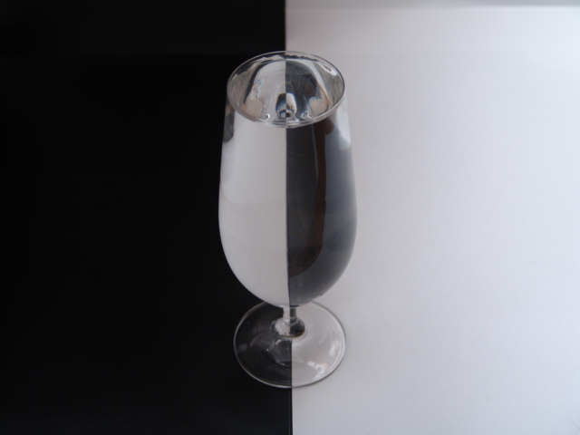
| I'm not keen about the angle you've chosen to shoot from, it makes for weird reflections in the glass opening. There is also some color in the photo which I'm sure you've heard already so I won't belabor it. |
|
|
|
11/23/2004 09:36:48 PM |
| What I've noticed is that the photograper can improve on a trite idea, the picture will get low marks. I like the profile reflection in the top of the glass. That is new! What lets the picture down is the dingy white and not so sharp focus. I think both of these could have been corrected using the basic editing rules. |
|
|
|
11/23/2004 01:23:47 PM |
| would look better if the colors were more bright |
|
|
|
11/23/2004 02:30:33 AM |
| I guess it could be my screen but it seems to have a very slight bluish cast. |
|
|
|
11/22/2004 10:14:49 AM |
| I've seen this done before and really like the idea. This one seems a little blurring, especially around the top edge of the glass. A little more DOF would have helped... |
|
 Photographer found comment helpful. Photographer found comment helpful. |
|
|
11/21/2004 03:41:49 PM |
| Well the subject is black and white but this is a color photo to me |
|
|
|
11/21/2004 04:14:28 AM |
|
| Photographer found comment helpful. |
|
|
11/20/2004 08:00:13 PM |
| An interesting study in the physics of light -- works well in black and white. Great photo! |
|
| Photographer found comment helpful. |
|
|
11/20/2004 07:35:25 AM |
| Boring even when it's well done... Imagine how boring when not really on focus!! 2 |
|
|
|
11/20/2004 01:48:16 AM |
| True the colors are black and white, but looks like a color photo |
|
|
|
11/19/2004 08:04:18 AM |
| you didnt desaturate it .. there's a brown tint .. |
|
| Photographer found comment helpful. |
|
|
11/19/2004 01:54:59 AM |
| Nice concept but this is not a B&W photo in the strictest sense. Sorry. |
|
|
|
11/19/2004 12:42:46 AM |
| interesting concept but it isn't B&W IMO |
|
|
|
11/18/2004 07:56:43 PM |
| Very nicely done, it looks to me like this was not shifted all the way to B&W, just mostly desat? Anyhow, 8. |
|
| Photographer found comment helpful. |
|
|
11/18/2004 02:43:37 PM |
| ok I have seen around a dozen of these shots so far. They all seem too use glasses. I still like it because I still have no clue how its done. But I do feel that using somthing other than the same old glass would earn you your higher and well deserved points |
|
|
|
11/18/2004 01:15:52 PM |
| Cool still life, but it's lacking a point of interest for me. Perhaps sparkling water in the glass, or something like that? Technically this is well executed, but I just can't find something to grab my attention. |
|
|
|
11/17/2004 11:23:25 PM |
| Very creative and well executed. 9 |
|
| Photographer found comment helpful. |
|
|
11/17/2004 08:52:18 PM |
| Good idea and neat execution. Funny how you left the color. Slightly distracting shadow in upper right. Since this image is so perfectly balanced, I wonder how a square format would look. |
|
| Photographer found comment helpful. |
|
|
11/17/2004 05:25:37 PM |
| Well executed. Some more contrast in post eidt mighthave lifted this to an 8 for me. But the reflections may have then got out of hand? 6. |
|
| Photographer found comment helpful. |
|
|
11/17/2004 02:33:07 PM |
| Yes! I love that inner image - wow! I think it could have been improved with a little more contrast - hope you do well |
|
| Photographer found comment helpful. |
|
|
11/17/2004 02:06:38 PM |
|
|
|
11/17/2004 12:39:30 PM |
| the colors are B&W, but the photo looks color. |
|
|
|
11/17/2004 11:57:29 AM |
| wow.. bravo, i like the yin yang-ey feel to this one |
|
|
|
11/17/2004 11:49:35 AM |
| Very nice, I especially like the reflection of the glass in the top of the glass |
|
| Photographer found comment helpful. |
|
|
11/17/2004 11:08:49 AM |
| Needs to be shaper but its a nice image 6 |
|
| Photographer found comment helpful. |
|
|
11/17/2004 09:28:05 AM |
|
| Photographer found comment helpful. |
|
|
11/17/2004 08:59:13 AM |
| a good take on an old motive. there are some minor technical problems: reflection on top R of glass, too harsh light in top R of frame, annoying reflections on base of glass and a distraction in top L of glass and the tones seem to be impure, or muted. But I really like the small glass in the reflection in top. |
|
| Photographer found comment helpful. |
|
|
11/17/2004 02:33:19 AM |
| I know it's argueable, but's not really black and white... And it's been seen recently done many times. So those will cost you a bit... |
|
|
|
11/17/2004 01:34:08 AM |
| The image looks a little dark, could do with some levels or curves adjustment. |
|
| Photographer found comment helpful. |
|
|
11/17/2004 12:37:41 AM |
| not bad, but it needs something, perhaps more contrast to make it stand out more. looks like theres some color in the glass too, dunno if that was on purpose or not. |
|
| Photographer found comment helpful. |
|
|
11/17/2004 12:30:51 AM |
| The focus on the glass is a little soft and the white looks quite grey. A levels/curves enhancement or more light in the setup would make a significant improvement. |
|
| Photographer found comment helpful. |
|
|
11/17/2004 12:27:03 AM |
|
Home -
Challenges -
Community -
League -
Photos -
Cameras -
Lenses -
Learn -
Help -
Terms of Use -
Privacy -
Top ^
DPChallenge, and website content and design, Copyright © 2001-2025 Challenging Technologies, LLC.
All digital photo copyrights belong to the photographers and may not be used without permission.
Current Server Time: 03/12/2025 06:53:13 PM EDT.