| Author | Thread |
Comments Made During the Challenge  |
|
|
11/23/2004 02:45:45 AM |
|
 Photographer found comment helpful. Photographer found comment helpful. |
|
|
11/21/2004 08:36:17 PM |
| Nice contrast in textures here. 8 |
|
| Photographer found comment helpful. |
|
|
11/21/2004 04:58:04 PM |
| I really like this shot well lit, but maybe a bit of a crop off the right to remove the white area for my taste. well done! |
|
| Photographer found comment helpful. |
|
|
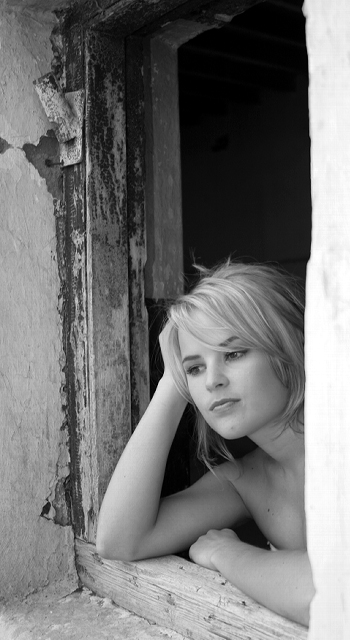
11/21/2004 04:54:10 PM |
returning for comments:
Lovely to look at. A very nice pensive look which contrasts good with the dilapidated window. Bumping to 6 |
|
| Photographer found comment helpful. |
|
|
11/20/2004 02:24:56 PM |
| Excelent blending, and composition! The model's blond hair works very well with the foreground (right frame) Zone 8/9 and the background's bare blac of zone 1. Nice work! |
|
| Photographer found comment helpful. |
|
|
11/20/2004 01:17:53 AM |
| I would have cropped out the white window frame or curtain on the right, but apart from that, a great shot. |
|
| Photographer found comment helpful. |
|
|
11/19/2004 09:26:37 PM |
| The narrowness feels awkward to me. Excellent lighting on the model. Would also be nice to have the foreground window frame in focus it's blurred enough to be a distraction as bright as it is. |
|
| Photographer found comment helpful. |
|
|
11/18/2004 10:55:13 PM |
| I like the contrast of textures. |
|
| Photographer found comment helpful. |
|
|
11/18/2004 11:09:44 AM |
| Too bad spot editing is not allowed here, because right side of the frame could use a little "burning in" to add some tone to the large white area. Good work. |
|
| Photographer found comment helpful. |
|
|
11/17/2004 07:11:11 PM |
| right side is a little too blown out, looks slightly distracting. everything else looks superb, i love the texture on the window! |
|
| Photographer found comment helpful. |
|
|
11/17/2004 12:13:22 PM |
| Feels like there is too much wasted space at the top, I would have cropped it tighter. |
|
Home -
Challenges -
Community -
League -
Photos -
Cameras -
Lenses -
Learn -
Help -
Terms of Use -
Privacy -
Top ^
DPChallenge, and website content and design, Copyright © 2001-2025 Challenging Technologies, LLC.
All digital photo copyrights belong to the photographers and may not be used without permission.
Current Server Time: 04/26/2025 08:47:40 PM EDT.