| Author | Thread |
|
|
11/05/2018 09:24:39 PM |
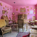
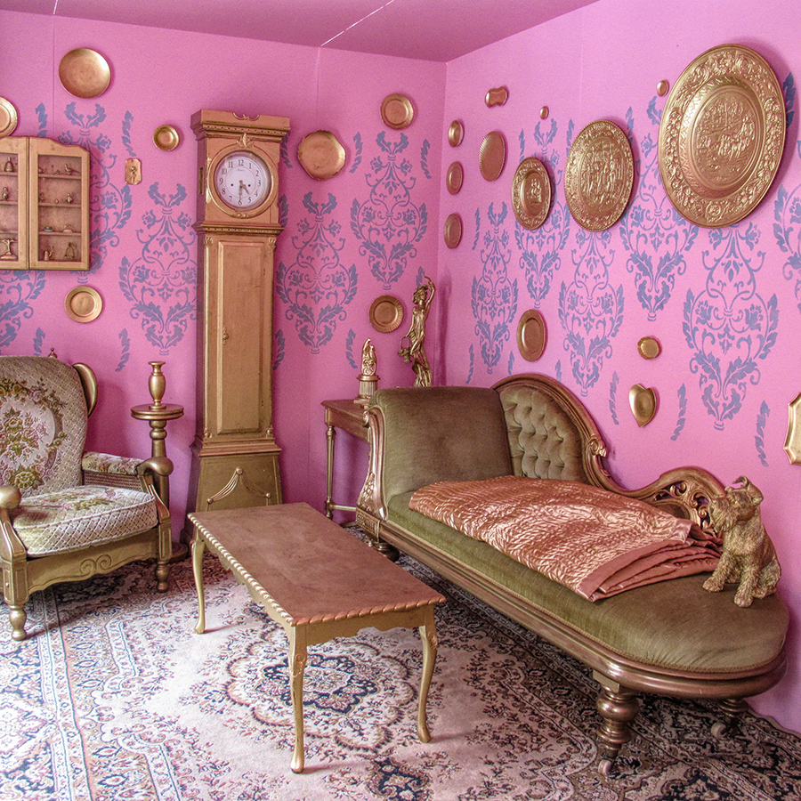
| I agree this is the more interesting picture of the two, I suppose because the room is more ordered and less cluttered here. I wonder what was the purpose of making all the furniture and decorations a uniform bronze color? Maybe it was intended to be reductive, make the view simplistic and easier to see as an "idea" rather than a collection of various objects. |
|
 Photographer found comment helpful. Photographer found comment helpful. |
|
|
11/05/2018 06:22:55 PM |
| Oh my, I could not live here . . . but then, that's the point. No one does :) I actually still have a "good room" though I've never called it that. But now that the kids are gone, I actually have the luxury of the space to have it. This is my favorite of the two halves. |
|
| Photographer found comment helpful. |
|
|
11/05/2018 06:16:41 PM |
This layout reminds me of the painting of Van Gogh's bedroom.
Thanks for the details (on the other shot). |
|
| Photographer found comment helpful. |
Home -
Challenges -
Community -
League -
Photos -
Cameras -
Lenses -
Learn -
Help -
Terms of Use -
Privacy -
Top ^
DPChallenge, and website content and design, Copyright © 2001-2025 Challenging Technologies, LLC.
All digital photo copyrights belong to the photographers and may not be used without permission.
Current Server Time: 03/10/2025 07:40:39 PM EDT.