| Author | Thread |
Comments Made During the Challenge  |
|
|
11/30/2004 08:56:52 PM |
returning for comment:
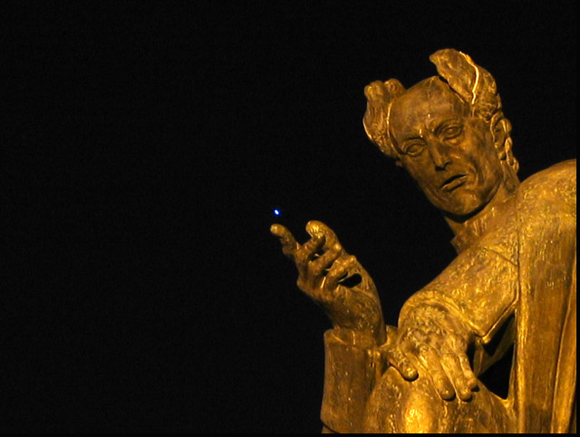
Very nice capture of statue. The golden tones are beautiful. Bumping up to 6 |
|
 Photographer found comment helpful. Photographer found comment helpful. |
|
|
11/30/2004 07:07:33 PM |
| What is that bright spot above the extended hand? A fire fly? I mean, what is it? I'm hoping this point of light isn't some famous statue feature that I haven't been aware of! :::blush::: |
|
| Photographer found comment helpful. |
|
|
11/30/2004 01:30:03 PM |
| What is the bright spot in the center of the photo? Great shot. |
|
| Photographer found comment helpful. |
|
|
11/30/2004 09:16:56 AM |
| Interesting effect with the light off the end of the finger. |
|
| Photographer found comment helpful. |
|
|
11/30/2004 05:31:41 AM |
| that blue dot is really the center of attention. |
|
| Photographer found comment helpful. |
|
|
11/28/2004 08:30:55 AM |
| this image would be fine without that white dot. it really kills the image. |
|
| Photographer found comment helpful. |
|
|
11/27/2004 12:07:07 PM |
|
| Photographer found comment helpful. |
|
|
11/26/2004 09:17:11 AM |
| Creative and risky choice in the framing of this image. The harsh light and shadow work well with the intensity of your message. I like that your subject moves off the right side of the frame, but there is a little too much negative space on the left. I know this was an artistic choice and I do like the idea of more negative space there than ususal, it just feel like a little too much so that it takes away from your main visual. Kudos on your courage to risk! |
|
| Photographer found comment helpful. |
|
|
11/25/2004 05:29:20 AM |
| I can't quite tell what's in his hand, it would be funny if it was a T.V. Remote though. |
|
| Photographer found comment helpful. |
|
|
11/25/2004 12:30:00 AM |
| great concept... i woulda used a little less negative space though... seems kinda distracting to me. just a though ;) 5 |
|
| Photographer found comment helpful. |
|
|
11/24/2004 01:03:59 PM |
Yeah, you damn pigeons! If ever I catch one of you sh**ting on my head... ;o)
Okay, let's talk serious. This statue definitely suggests authority, but the 'marks' on his head make him look too ridiculous to be impressive. And what's that blue spot? A star? That doesn't fit in there. |
|
| Photographer found comment helpful. |
|
|
11/24/2004 05:58:02 AM |
| Love the composition of this one. |
|
| Photographer found comment helpful. |
|
|
11/24/2004 01:08:06 AM |
| Um.... What is the blue light? Good use of negative space, but more depth-of-field on the statue, keeping it sharp, would help. |
|
| Photographer found comment helpful. |
Home -
Challenges -
Community -
League -
Photos -
Cameras -
Lenses -
Learn -
Help -
Terms of Use -
Privacy -
Top ^
DPChallenge, and website content and design, Copyright © 2001-2025 Challenging Technologies, LLC.
All digital photo copyrights belong to the photographers and may not be used without permission.
Current Server Time: 03/12/2025 08:14:15 AM EDT.