| Author | Thread |
Comments Made During the Challenge  |
|
|
11/30/2004 09:15:02 PM |
returning for comment:
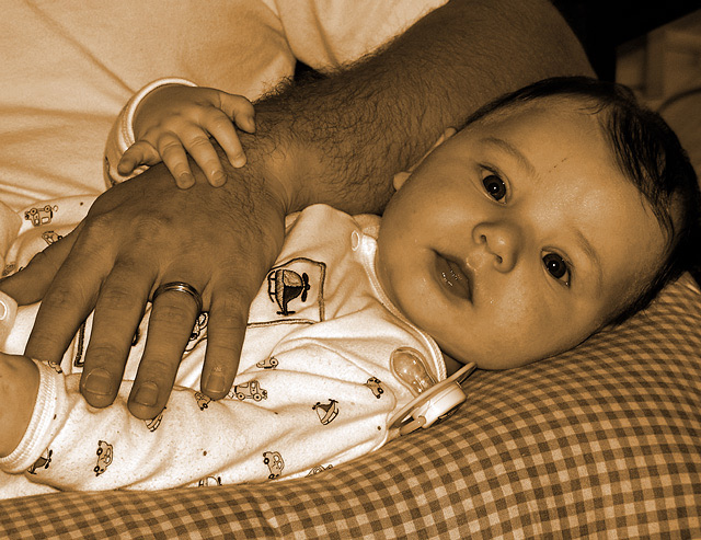
A lovely and touching image. I woud suggest a gamma adjustment as some of the delicate tones are repressed right about the 4,5 and 6th zones. However, you get a lot of credit for the great subject matter and composition. Bumping to 7 on that stare.lol |
|
 Photographer found comment helpful. Photographer found comment helpful. |
|
|
11/30/2004 05:26:25 AM |
| baby with a hairy arm. very cute kid. |
|
| Photographer found comment helpful. |
|
|
11/28/2004 11:29:34 PM |
| a bit too much yellow for my taste. |
|
| Photographer found comment helpful. |
|
|
11/28/2004 08:31:55 AM |
| cute, darling baby, Yes! authority shot, no... |
|
| Photographer found comment helpful. |
|
|
11/27/2004 12:10:13 PM |
|
| Photographer found comment helpful. |
|
|
11/25/2004 08:53:07 PM |
|
| Photographer found comment helpful. |
|
|
11/25/2004 05:45:07 PM |
| Really good - really captures dependence and authority |
|
| Photographer found comment helpful. |
|
|
11/25/2004 05:26:48 PM |
| The sepia toning is a little overdone. I'm not sure that I get "authority" from this picture either. It seems like yet another "take a picture of a kid, or your pets and try and squeeze it into the challenge by inventing a suitable title". |
|
| Photographer found comment helpful. |
|
|
11/25/2004 11:59:39 AM |
| Does not fit the challenge well - the title only makes things worse, as a mentor is usually an older person, one to follow. a baby is certainly not that! The sepia tone loses me too. |
|
|
|
11/25/2004 08:56:17 AM |
| I like this. If I were going to nit pick it like one of my own, I might have moved the passifier. And I miss the skin tones. I like the textures. |
|
| Photographer found comment helpful. |
|
|
11/24/2004 11:05:34 PM |
| This would better represent love, compassion, safety...Authority just doesn't come to mind when looking at this. Sepia tone is to over the top |
|
| Photographer found comment helpful. |
|
|
11/24/2004 08:42:41 PM |
| Nice capture - but I'm not sure that this sepia tone works. It's just not flattering - makes the baby look a bit jaundiced. Maybe straight b&w would be better. Also, would be improved if the baby's face did not have the hot spots. |
|
| Photographer found comment helpful. |
|
|
11/24/2004 06:48:06 AM |
| On the right upper corner, could be crop to give more attention to the baby, but i like the ideia. Good job. |
|
| Photographer found comment helpful. |
|
|
11/24/2004 05:58:43 AM |
|
| Photographer found comment helpful. |
|
|
11/24/2004 03:41:39 AM |
| Nice shot. The link to the challenge theme is poor (to me anyways, I also get that allready for my submission but I guess we all have different interpretations). Something about the color seems off (I also got that a lot on a previous submission). |
|
| Photographer found comment helpful. |
Home -
Challenges -
Community -
League -
Photos -
Cameras -
Lenses -
Learn -
Help -
Terms of Use -
Privacy -
Top ^
DPChallenge, and website content and design, Copyright © 2001-2025 Challenging Technologies, LLC.
All digital photo copyrights belong to the photographers and may not be used without permission.
Current Server Time: 03/12/2025 08:13:28 AM EDT.