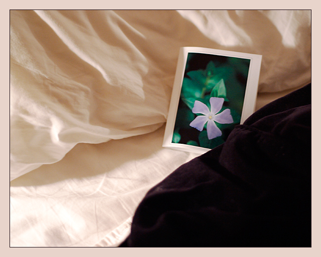
Greetings from the Critique Club!
COMPOSITION... Not at all bad here, maybe the photo is missing a bit of the elusive "wow" factor, but compositionally I find it sound. The subject is placed nicely off center, I like the contrast between the black and white sheets, and also the shadows falling on the covers - gives the sheets depth and shows their texture a little better. Don't like the way you see the end of the sheet at the bottom center of the image. May sound like nitpicking but it adds a distraction seeing that nowhere else in the photo do you find this feature - the sheets are otherwise continuous and cover the area of the image, and my eye just ends up always falling to that small section.
TECHNIQUE...colors are great, but a little too soft. You're using a very wide aperture which may contribute to the problem, but I have a hard time finding the part of the image that's totally in focus... A little sharpening applied to the image might help somewhat. At 1/8 of a second, i hope the camera was really steady or it may have contributed to the softness of the shot.
OVERALL... This is nonetheless an interesting image. A very small number of elements, few colors provide a simple, but elegant arrangement. |