| Author | Thread |
|
|
02/25/2003 02:14:31 PM |
CRITIQUE CLUB
First of all, for your fist submission, I just have to say THANKS for submitting. Don't give up based on the comments here.
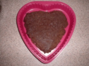
1. Backdrop- this looks like it was taken on a standard counter top or carpet?? Going with a flat black backdrop or white would have brought more emphasis to the subject.
2. Flash - Did you use the on-camera flash? See how it reflects on the bottom of the plate and causes a "circle" around the flash center? Honestly, if you don't have stand-alone flashes or a hot-shoe, try to compensate with your lighting. Beleive it or not, just moving this outside would have given you natural, beautiful lighting.
3. Lighting - You don't have to own professional studio lights to get better lighting. GE has "true color" bulbs out now that have a blue tint. They are the same cost as standard bulbs, but create a true light (not yellow, like in your photo). You can simply put it in a "snake" light and adjust the lighting on your subject. Obviously, this is low end, but it's a start for practice. Natural lighting also gives great results. Just take the item outside when the sun is high (but watch for shadows)
4. Blurry - you can correct this by sharpening your image after you resize it.
5. Cropping - cropping is allowed here, and you might want to zero in next time.
OVERALL - THANKS for submitting and take all comments with a grain of salt. Use the suggestions above and you will get a higher result next time! Take care! |
|
|
|
02/21/2003 06:29:23 AM |
Alright, your first submission. Nowhere to go but up.
Just remember that folks here really hate pictures that are out of focus. And don't forget to look at your picture objectively (forget about what you know about the picutre, look at it like you just stumbled upon it and have 3 second to make a choice to vote it between 1 and 10).
Good luck in the future challenges, and thanks for you first entry.
|
|
Comments Made During the Challenge  |
|
|
02/19/2003 11:08:14 PM |
| A good idea, but you really needed a little more light. Also, the angle that you have taken this from makes it look flat. Maybe if you had taken a bite out of it and lowered the camera angle, it would be more dynamic and not quite so static. |
|
|
|
02/19/2003 03:33:25 PM |
| Use the whole 640 pixel width. And share the fuge with me. |
|
|
|
02/15/2003 10:26:42 PM |
|
 Photographer found comment helpful. Photographer found comment helpful. |
|
|
02/15/2003 05:30:21 PM |
| Badly focused and lighted |
|
| Photographer found comment helpful. |
|
|
02/15/2003 10:43:33 AM |
|
|
|
02/15/2003 09:24:43 AM |
| A little too small and blurry to really have any impact. |
|
|
|
02/15/2003 09:19:03 AM |
| This picture lacks focus and size. Could have cropped a bit more to remove the black "thing" on the left. This could have bennefited from adding a border, IMO. |
|
| Photographer found comment helpful. |
|
|
02/15/2003 02:30:41 AM |
| It's such a small photo! hehe, did it taste nice? You have a bit of a glare from the flash, and it's a bit fuzzy. to make it more of a heart shape, I would have filled in all of the pan! good work -annida |
|
| Photographer found comment helpful. |
|
|
02/15/2003 12:36:13 AM |
Ok I got hamered the last time I said a photo sucked....
well this photo could be better.. the tile floor or whatever material is very UNapealing. the Pink Plastic thing is ok, but would be accentuated with a "silk" or at least PLAIN COLOR background, whtie perhaps. Also the angle of the photo, straight down is VERY amaturish, try a lower angel to elongate the subject and provide some depth of feild.. better luck next time.. |
|
| Photographer found comment helpful. |
Home -
Challenges -
Community -
League -
Photos -
Cameras -
Lenses -
Learn -
Help -
Terms of Use -
Privacy -
Top ^
DPChallenge, and website content and design, Copyright © 2001-2025 Challenging Technologies, LLC.
All digital photo copyrights belong to the photographers and may not be used without permission.
Current Server Time: 03/13/2025 11:29:20 AM EDT.