| Author | Thread |
|
|
02/27/2003 08:29:26 AM |
Well... That's a different take on love.
Red roses might say love, but this is a bit of a stretch for me.
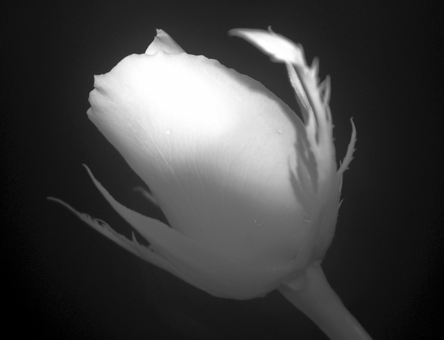
I like the angle of the flower, and the close-up. It might work as a square crop. Something about the horizontal orientation just doesn't seem right to me. I don't really think you needed water drops in this one. They don't add much IMO, and the light reflections on them look a little like hot pixels. The focus is good except for that one leaf - maybe it you turned the flower some so that it isn't coming forward so much. It wouldn't really bother me if there were other parts that were out of focus but having just that one area blurred sort of makes it pop out too much. I like the lighting on top and the shadow on the petals from the leaf. I'd like a little more light on the bottom and stem though because there just isn't enough detail/contrast there. The area in the middle of the petals - between the bright spot and the darker areas - is the best because you can see all of the detail.
It's really a cool shot though maybe not the best for this challenge. High quality with just a few nit-picky technical quirks. It's probably can't appreciate a lack of color at all. |
|
Comments Made During the Challenge  |
|
|
02/20/2003 05:07:27 PM |
| Challenge met, I guess, although I've seen stronger associations ... w/out the title I wouldn't necessarily think of love. I like unusual flower shots and b&w is unusual, so points for creativity. I like that some of the texture of the rose petals is visible. The stem and leaves look very pale, I would expect them to be darker but maybe you just used a dark rose. That does give this photo a little unreal feeling though. Your lighting is uneven, even if there aren't any glaring hotspots. I'd love to see a little more on the bottom of the rose and the stem, too. |
|
 Photographer found comment helpful. Photographer found comment helpful. |
|
|
02/17/2003 04:13:47 PM |
| Lack of contrast at the base of the flower head is odd. Focus seems too soft as well. |
|
|
|
02/17/2003 12:25:51 AM |
| Would like to have seen the upper right petal a little less exposed and more clear. Very pretty, anyway, good luck! |
|
| Photographer found comment helpful. |
|
|
02/15/2003 10:38:48 PM |
| I like this picture, but the blurry leaf on the right is distracting. :( |
|
| Photographer found comment helpful. |
|
|
02/15/2003 11:16:09 AM |
| Wow, that is neat. A bit more dept of field would be better but I still like it. Looks like infrared. Is it? Keep up the good work. Jacko. 8 |
|
| Photographer found comment helpful. |
|
|
02/15/2003 10:47:11 AM |
| doesn\'t really say LOVE to me.. sorry.. as for the shot the soft focus doesnt work well for me with such a close up shot... macro is about detail |
|
|
|
02/15/2003 02:32:34 AM |
| Great choice in black and white, good lighting. I like it a lot. -Annida |
|
| Photographer found comment helpful. |
|
|
02/15/2003 01:33:23 AM |
| Has a nice soft peaceful look. Good job. |
|
| Photographer found comment helpful. |
|
|
02/15/2003 12:46:21 AM |
| if I could vote, I would give you a 10 (best photo yet) however, I think the masses might like more of a pure black background... looks almost like fog... |
|
| Photographer found comment helpful. |
Home -
Challenges -
Community -
League -
Photos -
Cameras -
Lenses -
Learn -
Help -
Terms of Use -
Privacy -
Top ^
DPChallenge, and website content and design, Copyright © 2001-2025 Challenging Technologies, LLC.
All digital photo copyrights belong to the photographers and may not be used without permission.
Current Server Time: 03/12/2025 07:16:54 PM EDT.