| Author | Thread |
Comments Made During the Challenge  |
|
|
12/11/2004 06:51:19 PM |
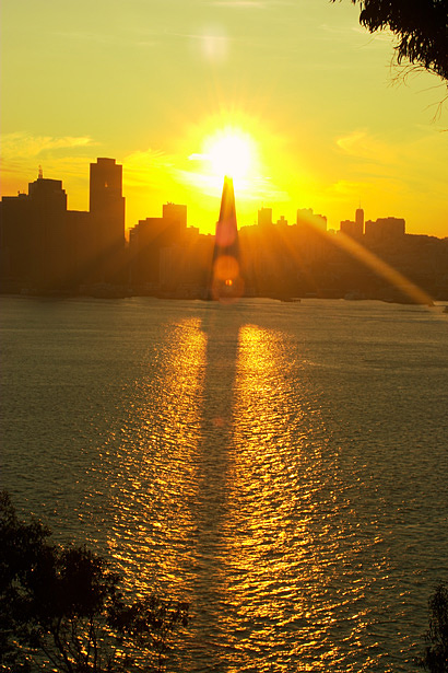
| too bright on top of the pyramid - toned down would make it a nicer photograph |
|
 Photographer found comment helpful. Photographer found comment helpful. |
|
|
12/10/2004 01:53:15 PM |
| Excellent positioning. Nice texture on thewater. A tad less exposure might have given some more color gradation around tower. Actually, I like this picture more when I desaturate the yellow to -40. The effect is still there but there is more color gradation. An 8. |
|
| Photographer found comment helpful. |
|
|
12/09/2004 11:31:22 AM |
| I've looked at this photograph about 5-6 times before finally voting and commenting. I like it and think it meets the challenge. And I know that white is a color, too. But it does appear too blown-out here. It detracts from an otherwise wonderful photograph. Hope this is helpful. :) |
|
| Photographer found comment helpful. |
|
|
12/08/2004 10:50:08 PM |
| nice colors and composition, but your horizon looks crooked to me. |
|
| Photographer found comment helpful. |
|
|
12/08/2004 07:44:18 PM |
| amazing shot..great texture |
|
| Photographer found comment helpful. |
Home -
Challenges -
Community -
League -
Photos -
Cameras -
Lenses -
Learn -
Help -
Terms of Use -
Privacy -
Top ^
DPChallenge, and website content and design, Copyright © 2001-2025 Challenging Technologies, LLC.
All digital photo copyrights belong to the photographers and may not be used without permission.
Current Server Time: 03/13/2025 08:08:41 PM EDT.