| Author | Thread |
Comments Made During the Challenge  |
|
|
05/04/2002 12:27:00 PM |
|
|
|
05/03/2002 10:50:00 AM |
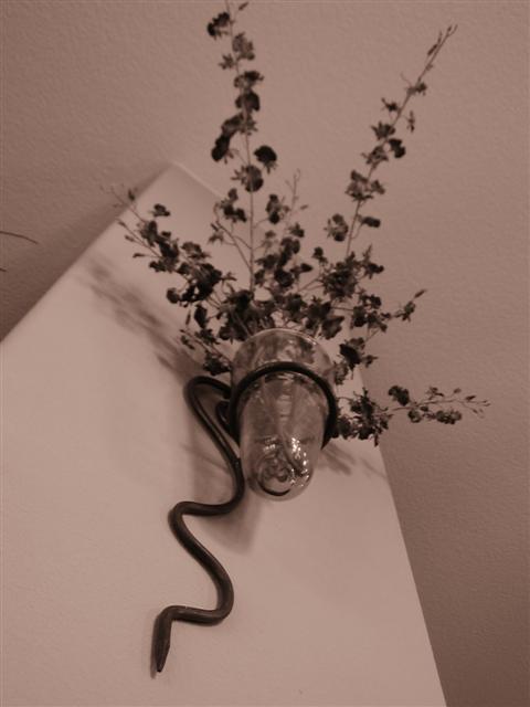
| I like the simplicity and angles in this photo. The focus doesn't seem to be quite right though. |
|
|
|
05/03/2002 08:23:00 AM |
| For a shot like this, I feel more DOF is necessary to focus the flowers as well as the vase. |
|
|
|
05/03/2002 07:42:00 AM |
| change setting for incandescent lighting maybe? Purplish cast here |
|
|
|
05/01/2002 01:24:00 PM |
| For me, the focus on this one just doesn't work. I like the way the walls and ceiling and corners contribute overall, but I want the vase, holder, and plant all to be in focus. I also would like to see those two branches coming in from the left removed. |
|
|
|
05/01/2002 10:32:00 AM |
| The field of focus peters out just up where things start to get interesting. This would be a tough shot to make work, as the texture of the ceiling is going to compete with the foliage no matter what you do. |
|
|
|
04/30/2002 06:40:00 PM |
| Don't care for the lighting and Focus. |
|
|
|
04/30/2002 01:10:00 PM |
| the colours a bit funny, would be nicer if the wall was whiter and there was some colour in the flowers |
|
|
|
04/30/2002 11:16:00 AM |
| Love the vase! Shame the top of the flower is cut off, and there are the other leaves poking into the picture on the left. For a non-challenge (where you can't do it) I would edit those out. |
|
|
|
04/30/2002 07:42:00 AM |
| Subject is fuzzy. More light on the subject would help focus and enhance the subject. |
|
|
|
04/30/2002 06:42:00 AM |
| I wish this was less blurry and brighter. |
|
|
|
04/29/2002 08:48:00 PM |
| Could use better focusing and a crop to get rid of that branch on the left. |
|
|
|
04/29/2002 05:16:00 PM |
| plant is out of focus, not a real interesting shot |
|
|
|
04/29/2002 04:29:00 PM |
| Might be a little flat. The focus seems like it should be more on the leaves at the top. I like the composition though, but I'm not convined that sepia was the best choice, I'd like to see it in color |
|
|
|
04/29/2002 03:53:00 PM |
| Nice angle, but I'd like to see it more in focus. |
|
|
|
04/29/2002 03:21:00 PM |
|
|
|
04/29/2002 02:54:00 PM |
| This shot looked much better from the thumbnai perspective... There are some definite focus issues on the plant branches. Achieving good depth of field is hard sometimes but it's worth the effort on a shot like this. I don't know what kind of camera you use, but a shot like this could have easily been made from a tripod with a smaller aperture to achieve full focus on this shot. If your camera doesn't allow this, you may wish to consider evaluating your subjects and working exclusively within the range of your camera's capabilities. Try this same shot again and move back from the wall about 18" and see if th focus doesn't improve some :) |
|
|
|
04/29/2002 01:52:00 PM |
|
|
|
04/29/2002 01:49:00 PM |
Did you lose the depth of field intentionally? It's a cool piece of art on your wall, but more in-focus would have enhanced this pic. |
|
|
|
04/29/2002 12:10:00 PM |
| I like the sepia look, but looks out of focus in some areas. |
|
|
|
04/29/2002 10:38:00 AM |
| Beautiful :). The curvy lines of the fixture on the wall draw the eye up to the flowers which burst out in all directions in a really dynamic way. My only criticism is that it seems a little bit blurry. |
|
|
|
04/29/2002 09:14:00 AM |
| good colours, needs work on the focus |
|
|
|
04/29/2002 07:17:00 AM |
| Sepia works well in this photo. |
|
|
|
04/29/2002 03:14:00 AM |
| I dont know if the colour cast on this photograph was intentional, but I find it takes away from the image. Really nice strong and vibrant colours would have added another dimension to this one. |
|
|
|
04/29/2002 12:44:00 AM |
| Looks like B&W mode on the G2. B&W here would probably have been done better by taking a color shot and converting in an image editing program after the fact. |
|
|
|
04/29/2002 12:40:00 AM |
| Needs more depth of field ... try using an f-stop of 8 or 11. |
|
Home -
Challenges -
Community -
League -
Photos -
Cameras -
Lenses -
Learn -
Help -
Terms of Use -
Privacy -
Top ^
DPChallenge, and website content and design, Copyright © 2001-2025 Challenging Technologies, LLC.
All digital photo copyrights belong to the photographers and may not be used without permission.
Current Server Time: 03/12/2025 01:31:49 AM EDT.