| Author | Thread |
|
|
09/06/2024 10:35:35 AM |
Originally posted by markwiley:
Originally posted by ThingFish:
Quote" Hopefully people skipped over the part in the challenge description that mentions: "Let's keep it classic, let's keep it simple..." I think I've missed that mark. Oh well, this was the strongest portrait I had."Unquote
I did read that and even posted a thread about it in the current challenge topic but it was removed with a message to me that it might not be a good idea to post that while the challenge was in the voting stage. My own entry was entirely based on that full challenge description but was voted down by most voters as they obviously didn't read or recognise that it adhered to the full challenge description. Neat's entry certainly did and she deserves the Red and imo should have taken the Blue. I am glad for you that you won the Blue as it is a beautiful entry in it's own right but like you yourself said it does not adhere fully to the challenge description. |
I can appreciate your perspective. However, I tend to take the challenge theme and especially the challenge description more as a general suggestion rather than a rigid rule. For entering and voting. If I have two candidate images and one is a stronger image but the other adheres more strictly to the challenge theme/description, I generally enter the stronger image. In my experience, the stronger image will result in a better score. Perhaps that is because people are paying close attention to the description. Or, perhaps it is because lots of voters are like me and see the theme/description as a guideline to inspire creative images rather than a strict rule in need of enforcement. |
Well it is NOT my perspective at all..It is what I thought we HAVE to adhere to. It's that I am a bit upset that I have been entering challenges very diligently believing that we HAVE to stick to the rules and description. Well damn the rules from now on then. From now on I won't adhere to any of the description anymore either and will take it as a loose guideline also. I have always believed in artistic freedom.And I hope the voters who like me have been taking it to the letter will then also relax their expectations and vote accordingly...My goodness to think how many entries I have voted down just because they did not fit the description 100%
Message edited by author 2024-09-06 11:00:46. |
|
 Photographer found comment helpful. Photographer found comment helpful. |
|
|
09/06/2024 10:18:12 AM |
Originally posted by ThingFish:
Quote" Hopefully people skipped over the part in the challenge description that mentions: "Let's keep it classic, let's keep it simple..." I think I've missed that mark. Oh well, this was the strongest portrait I had."Unquote
I did read that and even posted a thread about it in the current challenge topic but it was removed with a message to me that it might not be a good idea to post that while the challenge was in the voting stage. My own entry was entirely based on that full challenge description but was voted down by most voters as they obviously didn't read or recognise that it adhered to the full challenge description. Neat's entry certainly did and she deserves the Red and imo should have taken the Blue. I am glad for you that you won the Blue as it is a beautiful entry in it's own right but like you yourself said it does not adhere fully to the challenge description. |
I can appreciate your perspective. However, I tend to take the challenge theme and especially the challenge description more as a general suggestion rather than a rigid rule. For entering and voting. If I have two candidate images and one is a stronger image but the other adheres more strictly to the challenge theme/description, I generally enter the stronger image. In my experience, the stronger image will result in a better score. Perhaps that is because people are paying close attention to the description. Or, perhaps it is because lots of voters are like me and see the theme/description as a guideline to inspire creative images rather than a strict rule in need of enforcement. |
|
|
|
09/06/2024 02:54:58 AM |
Quote" Hopefully people skipped over the part in the challenge description that mentions: "Let's keep it classic, let's keep it simple..." I think I've missed that mark. Oh well, this was the strongest portrait I had."Unquote
I did read that and even posted a thread about it in the current challenge topic but it was removed with a message to me that it might not be a good idea to post that while the challenge was in the voting stage. My own entry was entirely based on that full challenge description but was voted down by most voters as they obviously didn't read or recognise that it adhered to the full challenge description. Neat's entry certainly did and she deserves the Red and imo should have taken the Blue. I am glad for you that you won the Blue as it is a beautiful entry in it's own right but like you yourself said it does not adhere fully to the challenge description.
Message edited by author 2024-09-06 03:33:57. |
|
| Photographer found comment helpful. |
|
|
09/06/2024 12:11:16 AM |
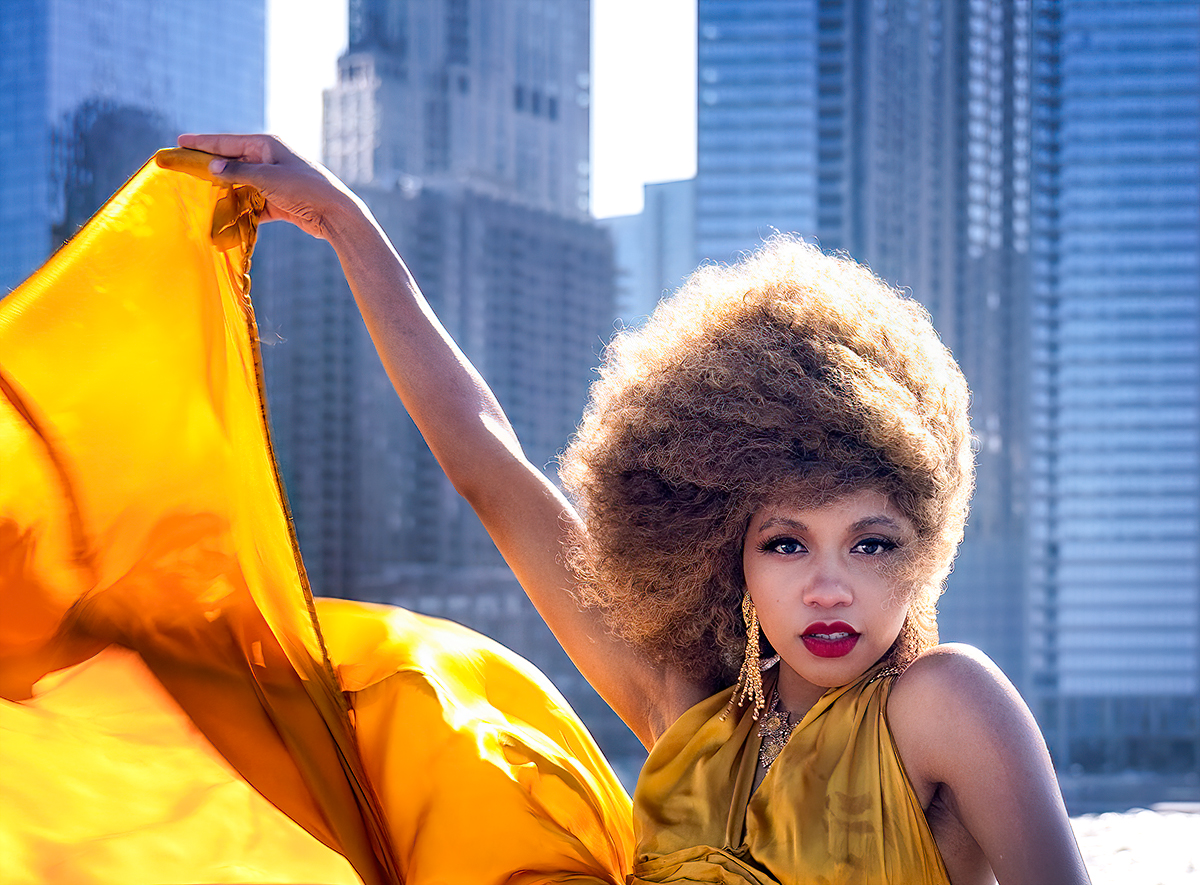
Hopefully, people skipped over the part in the challenge description that mentions: "Let's keep it classic, let's keep it simple..." I think I've missed that mark. Oh well, this was the strongest portrait I had.
It�s funny because I was mentioning to somebody else that most people don�t read that, I tend to read it 99% of the time, part of me thinks that it�s the non-participants that generally do not read the description and pump up the score.
Having said that there was no other photo that came close to this one so it was always going to be the blue.
Message edited by author 2024-09-06 00:32:47. |
|
| Photographer found comment helpful. |
Comments Made During the Challenge  |
|
|
09/04/2024 11:19:44 PM |
| Definitely has to be the winner, looks like a Mark Wiley creation. I like the city backdrop and the way her hair is blowing in the wind. Would�ve been a 10 but not a big fan of the blown out highlights in the skyline, just a minor thing which probably could not have be avoided. |
|
| Photographer found comment helpful. |
|
|
09/04/2024 10:12:02 PM |
| Nice contrast between a cold city backdrop and a hot model )). In my top three |
|
| Photographer found comment helpful. |
|
|
09/04/2024 12:05:28 PM |
| My favorite in this challenge. |
|
| Photographer found comment helpful. |
|
|
09/03/2024 01:00:58 AM |
oh my goodness . !! .
this has everything .
an absolutely stunning model ..
perfect pose ..
woderful composition ..
amazing colours and light ..
incredibly awesome background with just the right focus ..
WOW .. !!!!! ..
hopefully blue with a really high score ..
not voting atm . :) |
|
| Photographer found comment helpful. |
Home -
Challenges -
Community -
League -
Photos -
Cameras -
Lenses -
Learn -
Help -
Terms of Use -
Privacy -
Top ^
DPChallenge, and website content and design, Copyright © 2001-2025 Challenging Technologies, LLC.
All digital photo copyrights belong to the photographers and may not be used without permission.
Current Server Time: 03/31/2025 07:21:54 PM EDT.


 Nessa in the Sun


