Konagor
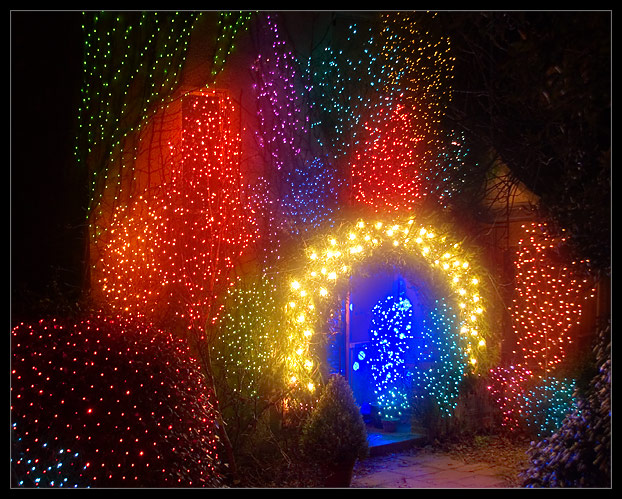
Technically, an excellent image. Nicely exposed, held just long enough to paint paint some of of the branches with detail but not so long as to wash out the colors.
I think my one nit would be in the composition - the placement of the doorway. It faces out of the frame, and combined with the walk, tends to lead the eye out of the image. It's an uncomfortable feeling. Like a person looking out of a frame, and the viewer not knowing what's there. It can be powerful if that's what the artist intended, but I'm not sure it was your intent here. Apologies if I'm incorrect.
As lovely as the colors are, they are only one element of the composition. They grab the viewer's eye. I think if the blue had been placed in the upper left third of the frame, approximately where the large patch of red lights are, the door and walk would pull the eye towards the middle of the frame.
Unless this is a close crop, it would mean reshooting the frame. I can't tell what is to the left and bottom, outside of the frame, but I think if it were more lights or if just faded to black, it would be a more pleasing composition.
If have the time to reshoot it, I'd be very interested in seeeing the results.
Just my opinion, of course. |