| Author | Thread |
|
|
11/23/2004 03:16:36 AM |
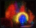
| Sorry, I submitted at the last minute and didn't have time to write them. Basically, I used a dark strokes effect and a brush strokes effect on different layers. I then erased different parts of each layer until each part of the photo had the amount of detail and darkness that I wanted it to have. I then dodged and burned and adjusted the hue/saturation slightly. |
|
|
|
11/22/2004 07:34:25 AM |
| My favorite! But where are the "How To" notes? |
|
 Photographer found comment helpful. Photographer found comment helpful. |
|
|
11/22/2004 12:34:39 AM |
| This was another image whose warm clay tones captured my imagination. Very nice. |
|
| Photographer found comment helpful. |
Comments Made During the Challenge  |
|
|
11/21/2004 11:47:24 PM |
| This was one of two entries that didn't fit what I thought of as "impressionist" but really liked. I gave it a 10. The lighting on the original image must have been great. |
|
| Photographer found comment helpful. |
|
|
11/21/2004 01:11:22 AM |
returning for comments
Very nice effect with beautifil clay colors. Nice stepping stair effect to give great interest to the comp. Bumping up. |
|
| Photographer found comment helpful. |
|
|
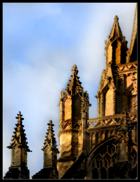
11/20/2004 11:18:38 AM |
Well composed, and the colours are great. A little dark at the bottom maybe.
I'm not convinced this is the best subject for this softening effect though, I think I'd prefer to see tall the detail nice and sharp. |
|
| Photographer found comment helpful. |
|
|
11/20/2004 03:21:28 AM |
| Your artistic take on this piece works quite well, in my unqualified opinion. I like the framing, contrast, and subdued tones. Overall clearly one of the strongest entries and I imagine this should do quite well. 7 |
|
| Photographer found comment helpful. |
|
|
11/19/2004 06:01:40 AM |
| I really liked the flow of this picture, but felt the contrast/detail was too high. |
|
| Photographer found comment helpful. |
|
|
11/18/2004 09:34:20 PM |
|
| Photographer found comment helpful. |
|
|
11/17/2004 07:39:17 PM |
| tough subject to impressionismize but quite well done. |
|
| Photographer found comment helpful. |
|
|
11/17/2004 07:33:33 PM |
| Like the gold color. The crop yields very nice depth. |
|
| Photographer found comment helpful. |
|
|
11/16/2004 07:22:03 AM |
| oh my ! The compostion...lighting....rich tones and repetition make this a winner ! Wonderful photo ! |
|
| Photographer found comment helpful. |
|
|
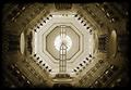
11/16/2004 01:32:26 AM |
I am only commenting and using a place holder score during this pass.
The subject is an interesting choice. I usually like this natural color pallette but somehow think that the picture could do with a little more brightness/lightness. But I'm only saying that based on a personal preference. I think it's the sharp contrast within the towers themselves that throws it off. |
|
| Photographer found comment helpful. |
|
|
11/15/2004 09:30:34 PM |
| An interesting point of view of this noble looking building. I like the subtle way you have used filters to give it a painted look. |
|
| Photographer found comment helpful. |
|
|
11/15/2004 07:05:46 PM |
| balanced composition, nice colors. i like the detail that remains, inspite of the effects used to achieve the result. can't say that i find the image that engaging, though. |
|
| Photographer found comment helpful. |
|
|
11/15/2004 04:48:45 PM |
| Reminds me of some of Monet's church paintings. Focus on shapes and light. |
|
| Photographer found comment helpful. |
|
|
11/15/2004 11:03:50 AM |
| Looks like a PS filter... I don't like the effect on this shot and don't think it looks particularly impressionist. 2 |
|
| Photographer found comment helpful. |
|
|
11/15/2004 09:12:55 AM |
| Great technique, I love it, but the subject doesn't really work for me. |
|
| Photographer found comment helpful. |
|
|
11/15/2004 04:41:28 AM |
| Excellent lighting and shadows, the color contrast between and spires and the sky creates interest. |
|
| Photographer found comment helpful. |
Home -
Challenges -
Community -
League -
Photos -
Cameras -
Lenses -
Learn -
Help -
Terms of Use -
Privacy -
Top ^
DPChallenge, and website content and design, Copyright © 2001-2025 Challenging Technologies, LLC.
All digital photo copyrights belong to the photographers and may not be used without permission.
Current Server Time: 03/12/2025 05:09:13 PM EDT.