| Author | Thread |
Comments Made During the Challenge  |
|
|
05/12/2002 10:36:00 PM |
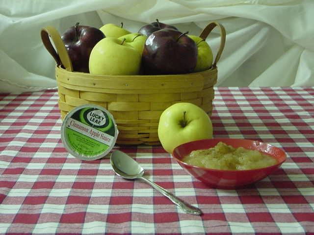
| Jar of ground cinnamon needed to complete this image. |
|
|
|
05/12/2002 08:32:00 PM |
| There's some strange coloration going on here that doesn't seem too appealing for the apples & applesauce. |
|
|
|
05/12/2002 07:50:00 PM |
| a jar of cinnamon would be a nice touch (?) wish the apples were shiny and bright too. good job. |
|
|
|
05/12/2002 05:46:00 PM |
| It's comming across a little heavy on the green. Good composition, and sells the applesauce. |
|
|
|
05/12/2002 12:16:00 PM |
| Very inviting composition. I probably would have liked the exposure a little brighter. The colors seem a little off. Nice effort. |
|
|
|
05/11/2002 06:30:00 AM |
| Almost like mama used to make... |
|
|
|
05/10/2002 05:05:00 PM |
| this is good setup---one point off for focus |
|
|
|
05/09/2002 03:14:00 PM |
| that sauce pot needs to be way up front, & spoon in the sauce. georgeous looking apples! |
|
|
|
05/09/2002 02:38:00 PM |
| This has a quaint feel to it. That goes with the product well. |
|
|
|
05/09/2002 01:29:00 PM |
| Colors are a little dull and dark |
|
|
|
05/09/2002 11:52:00 AM |
| subject seems too far away, but your concept is right on |
|
|
|
05/09/2002 12:03:00 AM |
| Very nice. The green tint needs to be fixed -- either color balance with the camera, or some kind of levels work in your image editing software. The focus seems a tiny bit soft on the bowl and the sppon handle. My last suggestion would be a slightly tighter crop to remove some of that "extra" tablecloth space. |
|
|
|
05/08/2002 10:43:00 PM |
| I like the mix of apples in the basket, and the inclusion of the the bowl and spoon makes you want to reach out for it. I think it would work better if you either zoomed in closer or left all the blank space to one side. I could see add text at the upper right and lower left, but the upper left seems like wasted space to me. |
|
|
|
05/07/2002 11:28:00 PM |
| I think this could have been a better photo with a lower angle. The high, far-back shot you've chosen makes everything seem very small ... and I think that's a drawback for a food shot. A closer angle might also have made the product more dominant. |
|
|
|
05/07/2002 09:35:00 PM |
| like the composition of this, but it looks too green to me! |
|
|
|
05/07/2002 08:47:00 PM |
| Yum! Nice placement, god choice of colors. A little dark. |
|
|
|
05/07/2002 01:59:00 PM |
| This one appeals (peels?) to me. It's photographed beautifully. |
|
|
|
05/07/2002 06:26:00 AM |
| clearer, more crisp lighting would have made this more exciting. |
|
|
|
05/07/2002 03:38:00 AM |
| Nice but I think the best thing about apple pics is the great colour and shine which you haven't really captured |
|
|
|
05/06/2002 11:07:00 PM |
| this is pretty good, but the apple sauce label isnt very clear. |
|
|
|
05/06/2002 10:51:00 PM |
| Seems to be a bit of a green tint, but that could be my moniter, nice subject, well done |
|
|
|
05/06/2002 02:45:00 PM |
| This is a nicely planned photograph. I think it needs a little more light to bring out the color some more. Good job! |
|
|
|
05/06/2002 02:15:00 PM |
| there is too much of a yellow hue to the photo |
|
|
|
05/06/2002 01:49:00 PM |
| Good concept, that could be improved by making the product label more prominent, perhaps closer to the camera and better lighting. |
|
|
|
05/06/2002 12:34:00 PM |
Nice idea and done well.
Maybe the apples are arranged too well here. Staged. We need the product closer. |
|
|
|
05/06/2002 11:27:00 AM |
| You got all, good photo! It advertises effectively. Photo 10 Advert 9 total 9 |
|
|
|
05/06/2002 10:01:00 AM |
|
|
|
05/06/2002 08:13:00 AM |
| The apples look awesome! But the applesauce looks kind of unappetizing, like baby food.......... |
|
|
|
05/06/2002 07:20:00 AM |
| There seems to be a green tint to the picture, probably from the light source. |
|
|
|
05/06/2002 06:48:00 AM |
| mm nice. greenish cast. nice rendition of the theme. |
|
|
|
05/06/2002 05:39:00 AM |
| I look at your shot to see how it strikes me as a consumer. It is simple and effective except for the product. It is to small & I would not remember the name when I got to the grocery store. Your picture however is a lot better than some of the artsy ones that totally miss the point. Keep it simple and with something the consumer will relate to which is what I think you were doing. |
|
|
|
05/06/2002 02:39:00 AM |
| Three things - first the nitpicking one. Turn the apple sauce container a bit to the left. 2. There seems to be a "fog" over the photo. I copied it into software and ran auto levels. It brightened up and seemed more alive. 3. Imo the composition is a big sterile. Maybe a close up? Something that adds drama and interest like stacking the apples behind the bowl of sauce and the product. |
|
|
|
05/06/2002 12:32:00 AM |
| This shot looks a little green |
|
Home -
Challenges -
Community -
League -
Photos -
Cameras -
Lenses -
Learn -
Help -
Terms of Use -
Privacy -
Top ^
DPChallenge, and website content and design, Copyright © 2001-2025 Challenging Technologies, LLC.
All digital photo copyrights belong to the photographers and may not be used without permission.
Current Server Time: 03/12/2025 02:20:28 PM EDT.