| Author | Thread |
Comments Made During the Challenge  |
|
|
01/23/2005 10:32:51 PM |
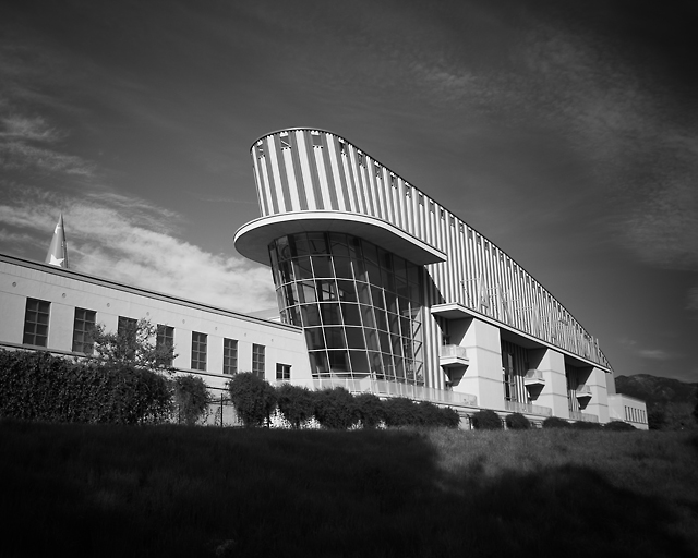
| The black and white looks great here, but I think I would have cropped out the dark shadow in the bottom of the frame and focused in more on the more interesting features rather than trying to include the whole building. |
|
 Photographer found comment helpful. Photographer found comment helpful. |
|
|
01/23/2005 07:21:29 PM |
| Nice. Would have liked to have seen it cropped closer and in colour. Such a cool building. 7 |
|
| Photographer found comment helpful. |
|
|
01/19/2005 11:55:46 PM |
| Building looks like Colonel Sanders hat. However, it's an interesting shot and a good point of view to display this architectural monstrosity. 6. |
|
| Photographer found comment helpful. |
|
|
01/18/2005 07:41:15 AM |
| good subject, but the foreground is a bit distracting as it is so dark - good luck |
|
|
|
01/17/2005 07:21:05 AM |
| I think I would have tried to get closer and remove th left quarter of theis frame. The flat part is wasted space,. however, its a nice image |
|
|
|
01/17/2005 03:48:05 AM |
| This lacks the contrast I like to see in black and white photography. For example, the sign on the side of the building is virtually invisible. A 4. |
|
Home -
Challenges -
Community -
League -
Photos -
Cameras -
Lenses -
Learn -
Help -
Terms of Use -
Privacy -
Top ^
DPChallenge, and website content and design, Copyright © 2001-2025 Challenging Technologies, LLC.
All digital photo copyrights belong to the photographers and may not be used without permission.
Current Server Time: 03/12/2025 10:00:41 AM EDT.