| Author | Thread |
Comments Made During the Challenge  |
|
|
05/12/2002 10:31:00 PM |
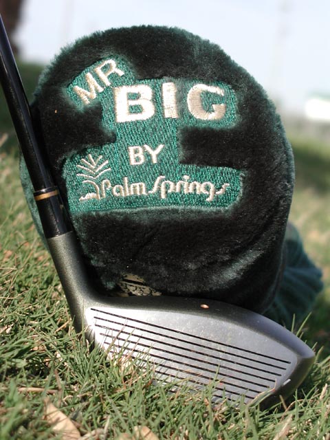
| Greener grass, and alighnment with the horizon, would have been very helpful to sell the product. |
|
|
|
05/12/2002 10:04:00 PM |
| Too washed out on top... not enuf thought/creativity in the setup. |
|
|
|
05/12/2002 09:04:00 PM |
| Odd angle, it seems that everything is tilted to the right. |
|
|
|
05/12/2002 08:06:00 PM |
|
|
|
05/12/2002 11:44:00 AM |
| Pretty nice shot and I am sure there are some golfers out there for you. |
|
|
|
05/11/2002 06:50:00 PM |
| I've been scouting around for some left-handed clubs... |
|
|
|
05/11/2002 05:12:00 PM |
| Product shows off well but the background needs improvement. Greener grass, minus the leaves, better focus in the background or have it arranged in such a manner so it's less obvious(more sky). Overall, I like it. |
|
|
|
05/11/2002 05:42:00 AM |
| Good shot.....are those fingers at the bottom? |
|
|
|
05/10/2002 05:29:00 PM |
| very good---I would have tried to light the top of club head more to better enhance the size |
|
|
|
05/10/2002 01:00:00 AM |
| If you'd found a patch of open shade you could have avoided the overexposure on the head of the driver and cover logo, and the colors might have snapped a little better. The patch of grass you chose doesn't look too well tended, and the white glare at R of the bg and dark area at L (interferes with the shaft) are unfortunate. It's a good composition, but would have benefited from a bit more care in the execution. |
|
|
|
05/09/2002 05:07:00 PM |
| the product needs more prominence, the head cover visually distracts from the club |
|
|
|
05/09/2002 02:28:00 PM |
|
|
|
05/09/2002 01:46:00 PM |
| Good focus. I, personally, would like to see more contrast in the colors. |
|
|
|
05/09/2002 12:06:00 PM |
| why did you choose to shoot at an angle like that, i think it hurts the photo |
|
|
|
05/07/2002 06:42:00 AM |
| I don't entirely get what its of but its well taken |
|
|
|
05/07/2002 04:31:00 AM |
| Um... what is it? Whatever it is, the colours are horrible... green and black, blech :P |
|
|
|
05/06/2002 10:28:00 PM |
| you should have chosen some nicer grass to work with, or at least remove the leaves before you took the photo. |
|
|
|
05/06/2002 06:51:00 PM |
If you're selling the club, why is it dirty and buried in the grass?
|
|
|
|
05/06/2002 01:36:00 PM |
| i really like the blurred out background |
|
|
|
05/06/2002 12:45:00 PM |
| Nice photo, nothing really wrong with it, but very little "gotcha" appeal. Photo 10 Advert 7 Creativity 7 total 8 |
|
|
|
05/06/2002 12:20:00 PM |
Nice job.
Would of liked better focus on the club--it's the subject not the cover. |
|
|
|
05/06/2002 10:17:00 AM |
| Nice shot! I play par 2 golf that has orange rails down both sides of the fairway.. Obstacles include gorillas and windmils and sometimes a loop-2-loop on the 18th green ;) |
|
|
|
05/06/2002 07:40:00 AM |
|
|
|
05/06/2002 06:50:00 AM |
| nice pic. a little washed out though. i would have picked up those seeds or whatever they are are in the grass. |
|
|
|
05/06/2002 05:35:00 AM |
|
|
|
05/06/2002 04:20:00 PM |
| Colors seem a bit flat, but I really like the angle and detail on this. |
|
Home -
Challenges -
Community -
League -
Photos -
Cameras -
Lenses -
Learn -
Help -
Terms of Use -
Privacy -
Top ^
DPChallenge, and website content and design, Copyright © 2001-2025 Challenging Technologies, LLC.
All digital photo copyrights belong to the photographers and may not be used without permission.
Current Server Time: 03/14/2025 01:03:06 AM EDT.