| Author | Thread |
|
|
05/13/2002 09:57:00 AM |
| I agree, definitely thought it would place |
|
|
|
05/13/2002 07:06:00 AM |
| i thought this would do much better! |
|
Comments Made During the Challenge  |
|
|
05/12/2002 10:33:00 PM |
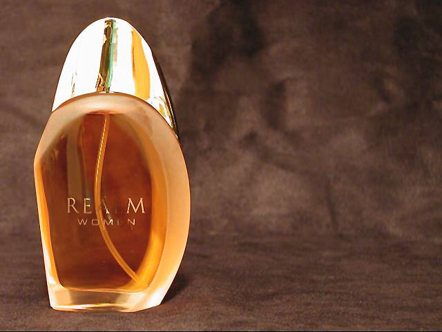
| very nice job, would have rated a bit higher if the name on the bottle were a ltitle more legible. but all in all very well done. |
|
|
|
05/12/2002 07:26:00 PM |
| would like to see less reflection in bottle, and the full label on bottle - clearly. Otherwise nice photo. |
|
|
|
05/12/2002 04:24:00 PM |
| Very nice, I especially like the background and the texture in this shot. How did you do that lighting? Excellent job |
|
|
|
05/11/2002 09:38:00 PM |
| This shot doesn't do much for me. It does look like an ad that would be in a magazine, so I think you caught the product and challenge well. The only problem that I can see with it is the name of the perfume is not readable on the bottle. Maybe a correction would be to turn the bottle just a bit towards the light to get the name. |
|
|
|
05/11/2002 07:59:00 AM |
| The background is great, but the foreground lighting needs to be tweaked a little to highlight the text more clearly, since it's the name you're trying to sell! |
|
|
|
05/10/2002 03:19:00 PM |
| Nice shot. THe product name isn't defined enough though, the L is missing.. |
|
|
|
05/10/2002 02:46:00 PM |
| 'm a little concerned that the "L" has disappeared (at least on my monitor)... |
|
|
|
05/10/2002 12:43:00 PM |
| the straw ruins the picture |
|
|
|
05/10/2002 12:30:00 AM |
| "Ream Womin"? The composition is okay, except that the bottle really ought to face into the frame instead of out. Lighting could be much better - the cap is just a mess of reflections and hotspots. This kind of thing - chrome and glass - is very hard to do, but I think you could do better than this even without studio gear. Try some white foam core to take control of the light and reflections next time. Also seems oversharpened. |
|
|
|
05/09/2002 10:04:00 PM |
| I need to see more of the word on the bottle. Other wise very nice. |
|
|
|
05/09/2002 03:36:00 PM |
| One of my favorites. Very crisp, well lit, good color choice for the backdrop, I like the empty space on the right. VERY WELL DONE!! (Does it smell good?) |
|
|
|
05/09/2002 03:22:00 PM |
| I don't like this at all but it fits with most perfume ads. Perfume and nothing else. Overused. |
|
|
|
05/08/2002 10:30:00 PM |
| I like the light coming through the bottle and the fact that you left room for ad text, but I think that the text on the bottle is too hard to read and the photo is a little noisy. |
|
|
|
05/08/2002 07:34:00 PM |
| wish I could read the label |
|
|
|
05/08/2002 05:59:00 PM |
| cant read whole name on item |
|
|
|
05/08/2002 03:39:00 PM |
| The name needs to be better lit. I think the background needs to be darker. |
|
|
|
05/08/2002 07:44:00 AM |
| very cool. great composition, framing. simplicity at it's best. i wonder why the letters are gone? eiuther your lighting wasnt set up to really bring the letters out. or you lost them to compression artifacts. that would be a number one priority though: having a clear name. still, a great shot. |
|
|
|
05/07/2002 11:36:00 PM |
| great use of negative space for 'copy' room. Top is a bit overexposed, but hard to light well. |
|
|
|
05/07/2002 11:19:00 PM |
| My two suggestions are first that the "L" in realm is lost a little on the lighting, and the company might not like that. Second, did you try ruffling the background up at all? I like the spots where it's rougher, and I think that might have looked cool if it were done with all the fabric. |
|
|
|
05/07/2002 10:23:00 PM |
| Handsome bottle and rather difficult to shoot. It looks like you had a little problem with lighting but well�it happens. Your choice of backgrounds compliments the bottle and the coloring of the perfume. The texture adds a softness. I'm not sure about the empty space to the right. At first glance it would seem like poor composition. But it seems to intentional to be that so I'm not going to assume. I ran auto levels on the image and it really balanced out the colors well and provided a more expensive look. Did you not like that look? Good job on meeting the challenge. |
|
|
|
05/07/2002 07:22:00 PM |
| dramatic composition, i like that you left space on the right to put ad copy, but it needs to have a little more care taken in lighting, specifically the product name is hard to read and the top is distractingly shiny |
|
|
|
05/07/2002 05:55:00 PM |
| Hard to read the writing on the bottle. |
|
|
|
05/07/2002 05:06:00 AM |
| beautiful. I really like the texture of the background. Goes very well with the colour of the perfume. My only gripe would be that the reflections don't really fit in. The top of the bottle has some quite large reflections which cause a distraction, and the product name is lost slightly ... it is quite hard to read the 'L' and 'E' of 'REALM' and 'WOMEN' respectively |
|
|
|
05/07/2002 04:39:00 AM |
| i like the large void you leave on the right. the grainy fabric you chose for a background is also mysterious and warm. the bright cap is interesting. only thing i feel wanting is the writing on the bottle. |
|
|
|
05/07/2002 02:51:00 AM |
I think the colour of the background is a bit dull to give the impression of richness and luxury you were after, although the variations in the colour and the overall texture is nice. Nevertheless, it's not nice enough to take up that much of the photo. The lighting is effective, but too strong, making the reflections on the lid blow out. The name of the product isn't clear... I can work out what it is, but in an advertising shot it would have to be 100% readable.
Otherwise a nice imitation of a perfume ad. |
|
|
|
05/06/2002 10:43:00 PM |
| the product name needs to be clearer for this to be a good advertisement photo. |
|
|
|
05/06/2002 07:02:00 PM |
| Can't read what is written on the bottle. Violates the first law of advertising - "let em know what the product is"! |
|
|
|
05/06/2002 06:48:00 PM |
| the L in realm and the e in women don't show up |
|
|
|
05/06/2002 05:57:00 PM |
| Nice background, and good use of space. The lighting is not so good, though, as I can't really see all of the letters on the bottle face. |
|
|
|
05/06/2002 05:15:00 PM |
| Nice idea, but can't really read the text on the bottle. |
|
|
|
05/06/2002 01:46:00 PM |
| too bad the chrome caused such a glare. |
|
|
|
05/06/2002 12:29:00 PM |
| Nice refelections and colors. I think you should have turned the bottle a little bit, so that the name on the bottle would have been clearly visable. |
|
|
|
05/06/2002 12:18:00 PM |
| You missed the "L" and part of the "E". Good photo. Photo 9 Advert 8 Creativity 8 total 8 |
|
|
|
05/06/2002 11:52:00 AM |
| It might be a carpeted stair but it does a good job of looking like suede. |
|
|
|
05/06/2002 11:46:00 AM |
| Overall, I really like the idea and I like the positioning of the bottle. But, I think it is really important that the name of the fragrance shows up well since it is supposed to be an advertisement for that product. You needed to somehow do the lighting differently. |
|
|
|
05/06/2002 11:09:00 AM |
| Beautiful composition here. Very nice job... This particular photo leave room for some ad copy if necessary... I hope that was the intention here, otherwise, I would have framed it a little differently... The only thing i dont like here is that the text on the bottle is not nice and clear agains teh background. Good job! |
|
|
|
05/06/2002 09:53:00 AM |
| Light and lack of contrast failed you here. Looks like it says REA M. Nice try and I love the lower half of the bottle. |
|
|
|
05/06/2002 09:53:00 AM |
| Its a nice photo, I don't agree that the rule of thirds applies to this type of advertisement and your product off to the left looks kinda weird. If you would have made your title "Realm, second to nothing" then that would have been cool, but you didn't. |
|
|
|
05/06/2002 06:57:00 AM |
| The "L" in Realm and the "E" in Women seems to be poorly lit. The background works great though. |
|
|
|
05/06/2002 05:29:00 AM |
| Great choice for the background:) The only thing that I think needs change is the name on the bottle. It's the main thing that says what you are selling and some of it can't be seen. Great set up and placement. |
|
|
|
05/06/2002 04:20:00 PM |
| difficult subject - needs name of product to be clear as priority to sell - colours and subject good but composition wrong - waiting for something to fill void on right. |
|
|
|
05/06/2002 04:05:00 PM |
| Very nice. Would have placed it a tad bit higher, except I think I can make out the photographer in the reflection on the bottie! :) |
|
Home -
Challenges -
Community -
League -
Photos -
Cameras -
Lenses -
Learn -
Help -
Terms of Use -
Privacy -
Top ^
DPChallenge, and website content and design, Copyright © 2001-2025 Challenging Technologies, LLC.
All digital photo copyrights belong to the photographers and may not be used without permission.
Current Server Time: 03/12/2025 08:39:46 AM EDT.