| Author | Thread |
|
|
05/20/2002 06:11:00 PM |
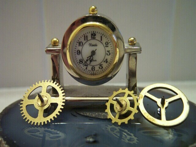
| The vertical lines in the photo are part of the design of the wall in the background. I see this was rather distractingt, and I would have done better to but a blank piece of paper up for the background. Thanks for all the comments, they were helpful. |
|
|
|
05/20/2002 06:08:00 PM |
| And for those who were confused, I'm selling miniature clocks, not gears. The gears were there to give perspective and show the size of the clock. |
|
|
|
05/20/2002 06:07:00 PM |
| This clock is 1 1/2" tall, and is sitting on a slab of agate approxiamtely 4 inches in diameter. The gears shown beside it are from a full size clock. |
|
Comments Made During the Challenge  |
|
|
05/12/2002 11:09:00 PM |
| Clock face is a little dark ... try some direct lighting on it ... that will keep you from over-exposing the other things |
|
 Photographer found comment helpful. Photographer found comment helpful. |
|
|
05/12/2002 10:05:00 PM |
| Are you advertising "time" or a clock? |
|
|
|
05/12/2002 08:05:00 PM |
| confused to what your ad is for. I wish the clarity was crisper and brighter |
|
|
|
05/11/2002 06:29:00 AM |
| I'm having a hard time finding the advertisement in this. It's a great photo. |
|
|
|
05/10/2002 04:57:00 PM |
|
|
|
05/09/2002 10:32:00 PM |
| I like the reflections on the geode. The photo seems to be a little out of focus, and the white vertical lines in the background are a bit distracting. |
|
|
|
05/09/2002 11:51:00 AM |
| i do not understand what this is advertising besides all desk clocks, what are the lines running vertical through the whole photo |
|
|
|
05/08/2002 01:30:00 PM |
| It's beatiful. My only suggestion would be to have a background that was completely smooth to eliminate the edge that cuts through the background. |
|
| Photographer found comment helpful. |
|
|
05/08/2002 01:06:00 PM |
| Focus on clock face is a little off. |
|
|
|
05/08/2002 11:04:00 AM |
| the clock face seems a little dark, perhaps using some white card stock or something to bounce some light into it would lighten it up without creating a glare. I'm not certain what the two "columns" are on the background. If they can't be removed, I'd consider moving your main elements so those strips are more centered on the rest of the image. You might also try the 10 to 2 or 10 past 10 settings for the clock hands (traditional advertising positions) -- that way they're not all bunched up in the same basic spot. |
|
| Photographer found comment helpful. |
|
|
05/08/2002 07:38:00 AM |
| oo, nice clock! would have blasted this with more light, right on the face of the clock. use a desk lamp or something with directional lighting. |
|
| Photographer found comment helpful. |
|
|
05/07/2002 12:23:00 PM |
| I'm not sure what is being advertised here. |
|
|
|
05/07/2002 10:49:00 AM |
| nice butthe BG is a bit distracting |
|
|
|
05/06/2002 10:29:00 PM |
| You're not going to sell me a clock by showing it fallen apart. |
|
|
|
05/06/2002 06:58:00 PM |
|
|
|
05/06/2002 05:52:00 PM |
| Great construction of the photo, and perfect gear placement. |
|
|
|
05/06/2002 02:52:00 PM |
| This doesnt exactly sell me into the product. Its like a car add with the engine taken apart. |
|
|
|
05/06/2002 01:47:00 PM |
| good concept, but a little fuzzy a far as clarity |
|
|
|
05/06/2002 01:40:00 PM |
| the pins in the wheels are out of focus |
|
|
|
05/06/2002 12:38:00 PM |
Nice idea and interesting old clock and gears.
Just looks too lined up, staged. Are you selling gears? Maker of the clock I can't read or see. |
|
|
|
05/06/2002 12:31:00 PM |
| Good photo, what are you selling? Photo 10 Advert 5 Creativity 9 total 7 |
|
|
|
05/06/2002 10:07:00 AM |
| I like the layout of this shot and the reflections are nice too :) The lighting on the face of the clock may be a little weak and I see those pesky vertical lines in this photo. I remember these in two of the stopped motion photos and I believe the resulting conclusion was a problem with an add on lens or something like that. I won't detract from my score for that at all though... Good Job! |
|
| Photographer found comment helpful. |
|
|
05/06/2002 08:11:00 AM |
| This could be more focused.. |
|
|
|
05/06/2002 06:49:00 AM |
| Am I being sold a clock or gears? :) |
|
|
|
05/06/2002 05:12:00 AM |
| This would stand out more if the focus were sharper and had a little shine or reflection on it. Nice concept though. |
|
|
|
05/06/2002 04:22:00 PM |
| focus looks to be out or maybe camera shake? did you use a tripod? |
|
Home -
Challenges -
Community -
League -
Photos -
Cameras -
Lenses -
Learn -
Help -
Terms of Use -
Privacy -
Top ^
DPChallenge, and website content and design, Copyright © 2001-2025 Challenging Technologies, LLC.
All digital photo copyrights belong to the photographers and may not be used without permission.
Current Server Time: 03/14/2025 09:24:21 AM EDT.