| Author | Thread |
|
|
12/24/2008 03:09:19 PM |
You should do more shots like this one. Experiment.
Message edited by author 2009-01-15 03:54:31. |
|
Comments Made During the Challenge  |
|
|
02/19/2005 06:31:26 PM |
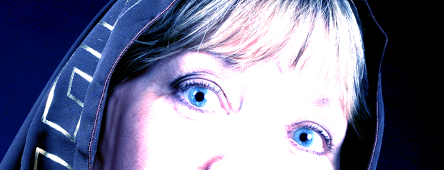
| nice idea... a tad blown out |
|
 Photographer found comment helpful. Photographer found comment helpful. |
|
|
02/18/2005 07:47:24 PM |
| I very much like the blue hood, especially the lines on the left part. The crop works for me too. The light, imo, is a bit too hot and doesn't add too much to the beauty of the photo. Love the blue eyes too. |
|
| Photographer found comment helpful. |
|
|
02/17/2005 10:38:56 PM |
| A cool graphical effect which leaves the eyes wanting to see more. The gaze and head gear are great. Bumping up. |
|
| Photographer found comment helpful. |
|
|
02/15/2005 11:05:51 PM |
| I like the comp, maybe a little blown out tho - Great Eyes.. |
|
| Photographer found comment helpful. |
|
|
02/15/2005 07:05:58 PM |
| Returning for comment. Good composition. Lighting doesn't flatter the skin tones, although it does bring out the drama in the eyes. Find myself wishing the eyes were level or at least looking directly at the lens. Overall, a decent shot. Good luck in the challenge. |
|
| Photographer found comment helpful. |
|
|
02/15/2005 06:57:16 AM |
| Ummm... I think it´s a very good idea. But, there are some things I don´t like. For example, I think the cropped wasn´t the best option. And, the lighting is different, but I got the impression people of Dpc doesn´t wanna see this effect (I like it). |
|
| Photographer found comment helpful. |
|
|
02/14/2005 07:27:21 PM |
Did you try to get the brown ribbon? If so you may succeed! This isn't art in my eyes, it's not even worth the Kilo bytes. Poor composition, extremly overexposed, and the effect doesn't even work. and the blue color is just harsh to my eyes. Gotta move on now, if you really thought this would score well, send me an e-mail, and I'll give you some tips that I think may help. 2
|
|
|
|
02/14/2005 07:17:21 PM |
|
|
|
02/14/2005 10:41:22 AM |
| having trouble loading your shot. I can only see the top 3/4 of the photo. So to be as fair as possible. I'll asume your better than average and give you a 6. Sorry this might have been a 10 or a 2 not sure. please contact the sc. I tried loading this 5 times and your shot freezes every time. |
|
| Photographer found comment helpful. |
|
|
02/14/2005 10:13:01 AM |
| I love those eyes! The crop and other editing really makes them stand out. Would have liked to see more detail in the rest of the face though. |
|
| Photographer found comment helpful. |
|
|
02/14/2005 03:16:17 AM |
| I love the crop and color of the eyes and hood...but I wish you hadn't blown out the skin. I know this was intentional, but it would have been more visually appealing to me with a natural skin tone. That way, the "shock" is in the vivid blue eyes instead of the blown out facial tones. Nice image though and love the crop! :) |
|
| Photographer found comment helpful. |
Home -
Challenges -
Community -
League -
Photos -
Cameras -
Lenses -
Learn -
Help -
Terms of Use -
Privacy -
Top ^
DPChallenge, and website content and design, Copyright © 2001-2025 Challenging Technologies, LLC.
All digital photo copyrights belong to the photographers and may not be used without permission.
Current Server Time: 03/12/2025 09:43:56 AM EDT.