| Author | Thread |
|
|
06/30/2010 12:27:56 AM |
i really like this idea! hmmmm possible deja vu challenge ideas brewing...
|
|
 Photographer found comment helpful. Photographer found comment helpful. |
|
|
05/28/2009 07:49:12 PM |
| really good photograph. keep up the creativity. |
|
| Photographer found comment helpful. |
|
|
09/05/2008 03:38:36 AM |
Originally posted by sguzel:
good |
yes |
|
| Photographer found comment helpful. |
|
|
09/05/2008 03:38:07 AM |
|
| Photographer found comment helpful. |
|
|
01/10/2008 11:54:30 AM |
| Great! Thanks for giving an idea of photographic art that can score well! Really glad to know that's possible. :) |
|
| Photographer found comment helpful. |
Comments Made During the Challenge  |
|
|
02/20/2005 11:46:51 PM |
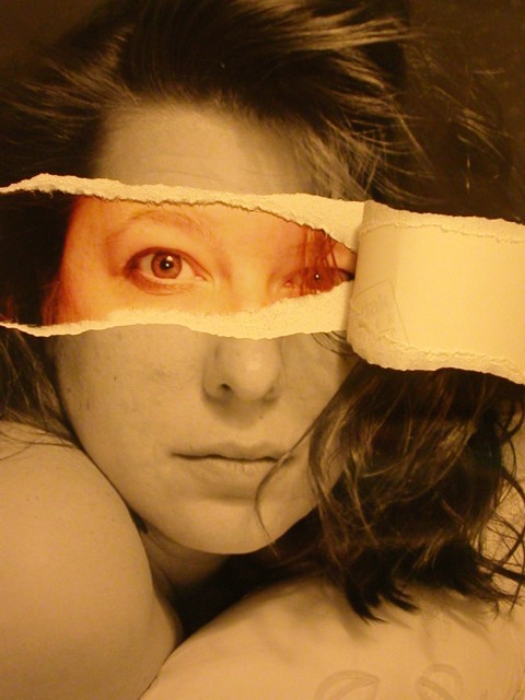
| Great idea. Only the strange color balance keeps me from giving it a very high score. There appears to be some glare on the top right corner, and you could have easily cloned out the Kodak logo on the print, but it's still a very expressive portrait. 7 |
|
| Photographer found comment helpful. |
|
|
02/20/2005 09:07:13 PM |
| What a unique presentation! Great job. :o) |
|
| Photographer found comment helpful. |
|
|
02/19/2005 03:18:54 PM |
|
| Photographer found comment helpful. |
|
|
02/19/2005 01:10:14 AM |
| A most interesting and clever photo. Well done ! One of my favorites. |
|
| Photographer found comment helpful. |
|
|
02/18/2005 10:11:07 PM |
| I'm floored. We've got the next Andy Warhol here ladies and gentleman. |
|
| Photographer found comment helpful. |
|
|
02/18/2005 04:33:41 AM |
| This would have been great if you were behind the B&W copy... Unless I'm mistaken that's a colour pic behind? Great idea though... 6 |
|
| Photographer found comment helpful. |
|
|
02/18/2005 02:18:41 AM |
| great concept.. but the white balance seems to be out of whack... I have never seen the back of photo paper look so yellow |
|
| Photographer found comment helpful. |
|
|
02/17/2005 10:56:14 PM |
| The girl behind the tear. The end result has been well achieved and you have my admiration. Bumping up. |
|
| Photographer found comment helpful. |
|
|
02/17/2005 05:36:09 PM |
Gorgeous photo!
Would love to know how did you do it so accuratly. |
|
| Photographer found comment helpful. |
|
|
02/17/2005 05:06:15 PM |
|
| Photographer found comment helpful. |
|
|
02/15/2005 11:16:16 PM |
| The thumbnail makes me yearn for more. There is a red cast to the color portion of the 'submission' display that undoes the impact of the graphic for me. Had the pic been entirely in sepia/bw, my personal opinon is that it would have been much stronger message. Nonetheless, nice work. |
|
| Photographer found comment helpful. |
|
|
02/15/2005 11:09:59 PM |
| great effect. a little soft on the focus and I'd prefer the tonal range to be a bit wider but this is a very eye catching shot in any event. |
|
| Photographer found comment helpful. |
|
|
02/15/2005 06:22:02 PM |
| Sweet! ;) Love that Idea, used it 10 years ago to make some posters of my band when we were playing around! :) |
|
| Photographer found comment helpful. |
|
|
02/15/2005 01:38:18 PM |
| Very creative and very well done! 9 |
|
| Photographer found comment helpful. |
|
|
02/15/2005 01:37:04 PM |
| I get the feeling you are trying to say you are ripped apart, torn apart inside. Very creative. 8 |
|
| Photographer found comment helpful. |
|
|
02/15/2005 12:51:13 PM |
|
| Photographer found comment helpful. |
|
|
02/15/2005 04:23:52 AM |
| cool idea but the colors seem a bit odd .... |
|
| Photographer found comment helpful. |
|
|
02/15/2005 12:27:35 AM |
| Though I've seen something similar before, it's a great idea. Unfortunately, the color beneath seems a bit drab. I'm assuming it's two pictures layered one over the other. Taking that third picture has the effect of flattening out any depth you had in the original picture. |
|
| Photographer found comment helpful. |
|
|
02/14/2005 07:21:54 PM |
| nice border...good color technique...I like this |
|
| Photographer found comment helpful. |
|
|
02/14/2005 07:13:03 PM |
| Very Clever! White Balance is off. In Photoshop Try clicking the white eye-dropper in Curves on the white paper and the picture should be better. |
|
| Photographer found comment helpful. |
|
|
02/14/2005 05:56:16 PM |
| Very cool and perfectly aligned. Nice catchlights as well. |
|
| Photographer found comment helpful. |
|
|
02/14/2005 04:42:40 PM |
| Creative. I really like this entry. I hope you do well.... stands out from the crowd! |
|
| Photographer found comment helpful. |
|
|
02/14/2005 03:33:34 PM |
| Nice work. I take it you liked e301's "What is the Matrix?" entry :) |
|
| Photographer found comment helpful. |
|
|
02/14/2005 02:24:55 PM |
| Wow, what a great idea! I like the label proving that it's photo paper, but most of all, the whole shot is bizarre in a good way. This must have taken some time. |
|
| Photographer found comment helpful. |
|
|
02/14/2005 11:56:25 AM |
| nice pic.great idea,cool colours |
|
| Photographer found comment helpful. |
|
|
02/14/2005 10:44:20 AM |
| if this was black & white it would be a 8 here, but the colors totally ruins it for me. 5 |
|
| Photographer found comment helpful. |
|
|
02/14/2005 10:21:32 AM |
| Wow! This is extremely creative. It feels a bit out of focus in the "exposed" area, or perhaps slightly overexposed, Also, excellent use of the frame - no dead space; It's all put to good use and very well balanced. I'd like to see a bit more contrast, but have to give you two thumbs up for a GREAT idea which was executed wonderfully! |
|
| Photographer found comment helpful. |
|
|
02/14/2005 10:02:59 AM |
Kodak paper. "For a Better Look"
Original. |
|
| Photographer found comment helpful. |
|
|
02/14/2005 09:32:00 AM |
| Great idea, well executed. |
|
| Photographer found comment helpful. |
|
|
02/14/2005 09:17:15 AM |
| Very creative, great execution with the alignment. Good lluck with this ripping work... |
|
| Photographer found comment helpful. |
|
|
02/14/2005 07:56:46 AM |
| I hope there will be details to this one. Very outside the box and well done ! |
|
| Photographer found comment helpful. |
|
|
02/14/2005 05:29:18 AM |
| It fits perfectly, clever idea! |
|
| Photographer found comment helpful. |
|
|
02/14/2005 04:52:46 AM |
| Neat idea and the alignment is excellent - I know it isn't easy! |
|
| Photographer found comment helpful. |
|
|
02/14/2005 01:12:54 AM |
|
| Photographer found comment helpful. |
|
|
02/14/2005 12:34:30 AM |
|
| Photographer found comment helpful. |
Home -
Challenges -
Community -
League -
Photos -
Cameras -
Lenses -
Learn -
Help -
Terms of Use -
Privacy -
Top ^
DPChallenge, and website content and design, Copyright © 2001-2025 Challenging Technologies, LLC.
All digital photo copyrights belong to the photographers and may not be used without permission.
Current Server Time: 03/12/2025 04:27:05 AM EDT.