| Author | Thread |
|
|
03/24/2003 06:00:40 PM |
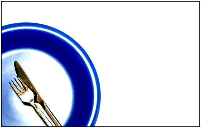
Greetings from the Critique Club!
Intial Impression:
I like this photo very much. It's simple and to the point.
Challenge:
Yup. Plate, fork, knife. Meets the challenge!
Composition:
I love negative space.. If used properly it can make a photo really zing. However, this is one of the rare times that I'm going to say that you might have too much of it. I think a square crop would really work for this photo.. You would end up with a visual line of interest from the bottom right corner to the top left corner, with just a bit of the plate in the way to capture your eye. This line of interest would be further enhanced by the positioning of the knife and fork that is already there.
Technical:
Very good camera work.. if I had to fault anything it would be that the cutlery isn't as crisp as I'd like it to be.
Processing:
Lovely contrasts and colours. I like the combination of the blue, white, and gold..
Overall:
Even with all my criticisms, it's still a striking photo and I very much like it. Great work!
-Matt
Message edited by author 2003-03-24 18:03:24. |
|
|
|
03/24/2003 06:37:11 AM |
I see that many people disliked the overexposed plate idea. Too bad, cause that was what I was trying to do in this one, so you get a multiple-layer border effect.. Perhaps not too well executed, unfortunately.
But thanks for all the suggestions! |
|
Comments Made During the Challenge  |
|
|
03/22/2003 10:07:15 PM |
| Artistiscally good idea. Too much white!--mainly because of the light on the plate. May be purposefully done, but too bright. Having the whole plate blue and keeping some of the lights "highlights" would appeal more to me. 5 |
|
|
|
03/21/2003 10:19:54 PM |
| A little over-exposed. Otherwise it would have been a neat shot. |
|
|
|
03/19/2003 02:11:18 PM |
Simple yet really cool. Love the color and composition.
Score: 8 |
|
|
|
03/19/2003 10:15:29 AM |
| nice use of negative space... I love the high key color contrast... nice work :) - setzler |
|
|
|
03/18/2003 01:02:51 AM |
| Well done, one of the best in the challenge. |
|
|
|
03/17/2003 12:54:59 PM |
| Nice color and composition. I especially like the hint of gold in the reflection of the tableware and the high contrast of the blue against the white. |
|
 Photographer found comment helpful. Photographer found comment helpful. |
|
|
03/17/2003 12:43:31 PM |
| Challenge met here. Sure like your use of 3rds. Color of plate is nice, but find it slightly washed out with the lighting as is the (gold?) fork. |
|
|
|
03/17/2003 11:10:07 AM |
| Simple compostion, but it needs something - maybe better focus. |
|
|
|
03/17/2003 12:48:22 AM |
| I like the colors but think the blue dish is a bit over exposed. |
|
Home -
Challenges -
Community -
League -
Photos -
Cameras -
Lenses -
Learn -
Help -
Terms of Use -
Privacy -
Top ^
DPChallenge, and website content and design, Copyright © 2001-2025 Challenging Technologies, LLC.
All digital photo copyrights belong to the photographers and may not be used without permission.
Current Server Time: 03/13/2025 12:58:46 AM EDT.