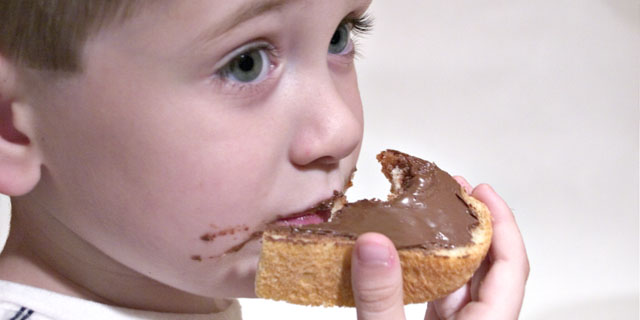
The model is my 4 year old son. Obviously, he was bribed with Nutella to strike a pose.
Cropped the image (slightly more than originally intended, but he left the bottle of Ozarka in front of my backdrop, and it would have been major element removal if I wanted to crop wider and remove the stupid bottle.
Oh, yes, there was no chance to talk him into eating another one for me - one was enough and that's all I've got.
After cropping, I adjusted levels to whiten the background, then cloned remnants of the ozarka bottle (very MINOR element now) below his ear, unsharp mask and that's it. This is the first challenge I feel I had a good idea and really worked on it. I hope at least it attracted some good comments...
Statistics
Place: 102 out of 148 Avg (all users): 5.1368 Avg (commenters): 5.7500 Avg (participants): 4.9886 Avg (non-participants): 5.2419 Views since voting: 1166 Views during voting: 317 Votes: 212 Comments: 5 Favorites: 0
ok, i am voting this challenge in 2 passes. in this pass, you will get a partial comment and a score. then i will come back to comment again. if you have any problem whatsoever with this comment, pm me and let me know. otherwise, take it with a grain of salt...i'm not trying to be a know-it-all, i'm just explaining where i'm coming from in voting this challenge. and, if this comment is NOT helpful (of if you think i'm full of $#!+), don't mark it helpful.
billboards are a science unto themselves. a lot of research has gone into determining just how much information a person can digest and retain in specific time spans. they use this information to develop formulas for determining the number of words and letters to use on billboards, as well as their sizes. they also determine the size and number of visual elements to include.
the graphics/photograph on a billboard are designed to get the point across in a moment. on the road, a driver will have less time with a billboard than a voter will give your image. this is a key element in the challenge: composing a shot that will get its point across quickly and succintly. along those lines, a strong composition will probably have few details and make strong use of negative space.
--------------------
great idea for a billboard, and a nice capture to help get your message across. i think it would have been stronger compositionally if it wasn't so centered (another 'rule' of billboards is that they are typically laid out left to right, with the graphics on the left, leading to the verbiage to the right. your were on the right track, just needing a bit more negative space to the right.) hope this works well for you. good luck!
I'm with you on the Nutella sentiment(love the stuff!), but the shot is a let-down in terms of technical content. Composition could be improved by by cropping his ear out and leaving more negative space to the right, but perhaps with a 'pack shot' visdible in the distance on a table or something.
Subject really needs to look happy too or it wouldn't sell many jars. Colour is a bit insipid and, with food particulalrly, you need to make it look rich, appetising and tasty looking.
Nice pic, but there should be an area for the printed message that does not get lost in the image itself. Close though - perhaps more space on the right and crop the ear off on the left. and SMILE! please, SMILE and show how you are enjoying the product!