| Author | Thread |
Comments Made During the Challenge  |
|
|
03/02/2005 12:23:37 AM |
| in to big of a hurry or just mis read the challenge...i did the same thing ;) |
|
 Photographer found comment helpful. Photographer found comment helpful. |
|
|
03/01/2005 07:32:20 PM |
| Beautiful colors and composition |
|
| Photographer found comment helpful. |
|
|
03/01/2005 10:46:57 AM |
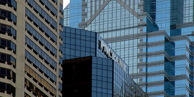
| For this to be effective, I think you need to be able to see all of the sign on the building and read it quickley (i.e. while driving by). At this angle, that's difficult. |
|
| Photographer found comment helpful. |
|
|
03/01/2005 04:40:49 AM |
| More of a straight on angle would make a stronger image. |
|
| Photographer found comment helpful. |
|
|
02/28/2005 08:09:48 PM |
| nice photo, but difficult to tell what it would be advertising. |
|
| Photographer found comment helpful. |
|
|
02/28/2005 07:36:26 PM |
i know who took this (but i'm going to vote and comment, anyway!)
ok, i am voting this challenge in 2 passes. in this pass, you will get a partial comment and a score. then i will come back to comment again. if you have any problem whatsoever with this comment, pm me and let me know. otherwise, take it with a grain of salt...i'm not trying to be a know-it-all, i'm just explaining where i'm coming from in voting this challenge. and, if this comment is NOT helpful (of if you think i'm full of $#!+), don't mark it helpful.
billboards are a science unto themselves. a lot of research has gone into determining just how much information a person can digest and retain in specific time spans. they use this information to develop formulas for determining the number of words and letters to use on billboards, as well as their sizes. they also determine the size and number of visual elements to include.
the graphics/photograph on a billboard are designed to get the point across in a moment. on the road, a driver will have less time with a billboard than a voter will give your image. this is a key element in the challenge: composing a shot that will get its point across quickly and succintly. along those lines, a strong composition will probably have few details and make strong use of negative space. |
|
| Photographer found comment helpful. |
|
|
02/28/2005 09:39:15 AM |
| If I saw this billboard, it would be hard to distinguish quickly enough what is it for. |
|
| Photographer found comment helpful. |
|
|
02/28/2005 09:25:51 AM |
| Probably would have taken to much from the image to have cropped that tiny whit space out. Nice shot with the complex windows and simple logo. Good luck... |
|
| Photographer found comment helpful. |
|
|
02/28/2005 07:13:52 AM |
| Love the texture of this one! 8 |
|
| Photographer found comment helpful. |
|
|
02/28/2005 12:42:45 AM |
| The letter/logo should be straight and upfront. Nice photo otherwise. |
|
| Photographer found comment helpful. |
Home -
Challenges -
Community -
League -
Photos -
Cameras -
Lenses -
Learn -
Help -
Terms of Use -
Privacy -
Top ^
DPChallenge, and website content and design, Copyright © 2001-2025 Challenging Technologies, LLC.
All digital photo copyrights belong to the photographers and may not be used without permission.
Current Server Time: 03/15/2025 05:41:29 AM EDT.