| Author | Thread |
|
|
05/13/2008 12:10:43 AM |
| WOW a great impact in this one..... |
|
 Photographer found comment helpful. Photographer found comment helpful. |
|
|
03/05/2005 12:13:57 AM |
| Heh, I thought this might be yours. I didn't have a problem with the dim cast members (for exactly the reason you described). Nice job- gave it an 8. ;-) |
|
| Photographer found comment helpful. |
Comments Made During the Challenge  |
|
|
03/04/2005 11:20:35 PM |
| A very professional-looking billboard for Broadway. This should make the top 10. |
|
| Photographer found comment helpful. |
|
|
03/04/2005 08:49:59 PM |
| This would be so perfect if it weren't for the shadows on the left... I love it! :o) |
|
| Photographer found comment helpful. |
|
|
03/03/2005 05:29:53 AM |
ok, i am voting this challenge in 2 passes. in this pass, you will get a partial comment and a score. then i will come back to comment again. if you have any problem whatsoever with this comment, pm me and let me know. otherwise, take it with a grain of salt...i'm not trying to be a know-it-all, i'm just explaining where i'm coming from in voting this challenge. and, if this comment is NOT helpful (of if you think i'm full of $#!+), don't mark it helpful.
billboards are a science unto themselves. a lot of research has gone into determining just how much information a person can digest and retain in specific time spans. they use this information to develop formulas for determining the number of words and letters to use on billboards, as well as their sizes. they also determine the size and number of visual elements to include.
the graphics/photograph on a billboard are designed to get the point across in a moment. on the road, a driver will have less time with a billboard than a voter will give your image. this is a key element in the challenge: composing a shot that will get its point across quickly and succintly. along those lines, a strong composition will probably have few details and make strong use of negative space.
-------------------
excellent shot! i've seen many billboards just like this leaving philadelphia, promoting atlantic city. it might take a little work cropping and such, but all the same, you got the idea. i am, however, curious as to how you got this shot (don't they discourage cameras, and even threaten confiscation?)...anyways, i hope this does well for you. good luck! |
|
| Photographer found comment helpful. |
|
|
03/01/2005 02:48:04 PM |
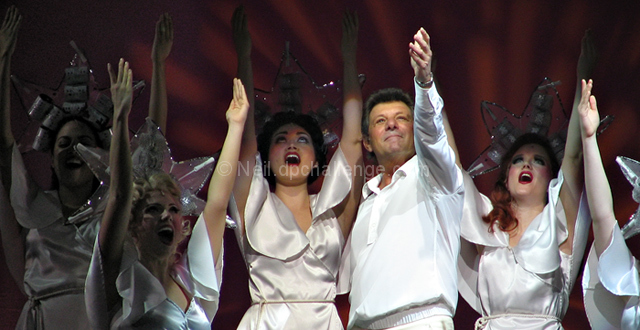
| The one and 3/4s of the leftmost people are in the dark - it would look weird on a billboard. |
|
| Photographer found comment helpful. |
|
|
03/01/2005 01:43:14 PM |
| He's waaaayyyy too old to play that part |
|
| Photographer found comment helpful. |
|
|
02/28/2005 10:12:46 PM |
| What a GREAT capture! He is focused on perfectly! The lighting and the colors are really good. You should try to get him to look at this one. It would make a great vegas billboard. 9 |
|
| Photographer found comment helpful. |
|
|
02/28/2005 01:38:24 PM |
|
| Photographer found comment helpful. |
|
|
02/28/2005 01:21:35 PM |
| Interesting shot. The lighting seems to be a little off thou (?). |
|
| Photographer found comment helpful. |
Home -
Challenges -
Community -
League -
Photos -
Cameras -
Lenses -
Learn -
Help -
Terms of Use -
Privacy -
Top ^
DPChallenge, and website content and design, Copyright © 2001-2025 Challenging Technologies, LLC.
All digital photo copyrights belong to the photographers and may not be used without permission.
Current Server Time: 03/12/2025 07:28:00 AM EDT.