| Author | Thread |
|
|
03/23/2005 09:58:36 PM |
Happy easter, and greetings from the Critique Club!
First, congratulations on an 86% percentile and top 50 positioned image. Well deserved in a wide challenge with many contenders.
You have chosen an almost-square crop for this image. I think it works very well for a centered/all-covering composition like this. The lines work against each other, and the fact that it's not entirely diagonal adds a little disturbance against the chosen cropping, and that makes the image more exciting.
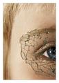
You've captured a sharp and clear, well-contrasted image of a difficult subject. You need to get up close to get it, and it needs a well-placed light. You've done all these things well. The only thing I want to pick on is that I think the frame is nicely placed, but it is twice as large as I'd like it to be. However, I really like the colors, the glow, contrast that tells me that you've done great both in capturing the image and post-processing it.
It meets the challenge, of course, and a good interpretation of it given your title. Depicting the flow of time and life with a flower might be a cliche, but a good one that you've used well.
Technically, it's a good shot. You seem to have had a lot of light to do this, and you've captured good detail. I had a look at your portfolio, which is pretty impressive and variated - you seem to know what you're doing, so a technical critque won't be nescessary.
It's hard to critique an image that contains this little, but you have done well in creating a simple, yet impressive shot. The glow and the really close macro is what gets you ahead of the other flower shots in this challenge.
If you have any questions or comments about this critique, please PM me. |
|
 Photographer found comment helpful. Photographer found comment helpful. |
Comments Made During the Challenge  |
|
|
03/20/2005 10:53:01 PM |
|
| Photographer found comment helpful. |
|
|
03/20/2005 05:38:58 AM |
|
| Photographer found comment helpful. |
|
|
03/19/2005 06:46:23 PM |
|
| Photographer found comment helpful. |
|
|
03/18/2005 03:46:04 PM |
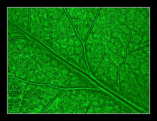
| The colors are beautiful, but for me, the frame is way too big. I think it takes the focus away from your image. The image is good enough to stand on its own, in my opinion - or with a very thin black frame. |
|
| Photographer found comment helpful. |
|
|
03/18/2005 02:00:00 PM |
| This looks like something that would be in a School Book for Science... Nice shot. |
|
| Photographer found comment helpful. |
|
|
03/17/2005 11:16:21 PM |
| I like the color but the border is way too wide |
|
| Photographer found comment helpful. |
|
|
03/17/2005 05:35:09 AM |
| Very nice, the lines are clear and the green is enticing. |
|
| Photographer found comment helpful. |
|
|
03/15/2005 11:43:04 PM |
| The lighting is very even across the whole image. Cool. |
|
| Photographer found comment helpful. |
|
|
03/15/2005 09:35:56 PM |
| surreal looking, almost a neon glow, very nice |
|
| Photographer found comment helpful. |
|
|
03/15/2005 12:44:37 PM |
| Really nice picture. Very detailed. I would have gone with a smaller border, it takes away from the pic a bit. |
|
| Photographer found comment helpful. |
|
|
03/15/2005 10:25:10 AM |
| The detail in the photo is great |
|
| Photographer found comment helpful. |
|
|
03/14/2005 05:40:54 PM |
|
| Photographer found comment helpful. |
|
|
03/14/2005 03:32:03 AM |
Very well done and presented image. Did you iron it to get it looking like that? :)
It works and works and works for me. Beautiful stuff. |
|
| Photographer found comment helpful. |
Home -
Challenges -
Community -
League -
Photos -
Cameras -
Lenses -
Learn -
Help -
Terms of Use -
Privacy -
Top ^
DPChallenge, and website content and design, Copyright © 2001-2025 Challenging Technologies, LLC.
All digital photo copyrights belong to the photographers and may not be used without permission.
Current Server Time: 03/14/2025 03:43:20 AM EDT.